
Project Overview
Great Heights Therapy is a small, family-run NDIS disability support group in Australia. When they approached me, they needed a professional logo and simple brand system quickly to use on official documents, marketing materials, and online channels.
The brief called for a design that was simple, clear, bright, and approachable—communicating warmth without sacrificing professional credibility.
Ideation & Strategy
From early discussions, it was clear the brand needed to balance warmth and trust. I wanted the logo to feel personal, human, and welcoming without looking corporate or clinical.
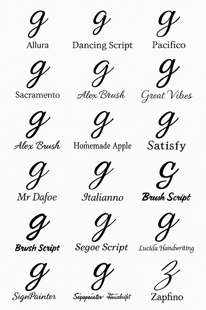
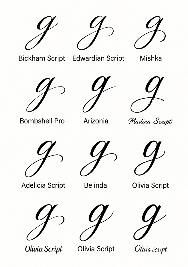
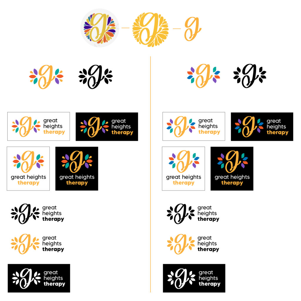
We focused on a handwritten-style cursive ‘g’ as the centrepiece—a direct nod to “Great” that also felt friendly and approachable. The idea was to evoke a signature-like quality, reinforcing the family-run, hands-on nature of the service. It needed to be instantly recognisable but simple enough for everyday use on documents and forms.
Design & Development Process
Once the cursive ‘g’ form was refined, I experimented with colour and composition. Surrounding it, I introduced a series of floral-inspired coloured elements in warm blues, fresh greens, and gentle corals. These shapes suggested organic growth and support—echoing the idea of clients reaching their own “great heights” in a caring environment.
The floral colours added softness and life without feeling overly feminine or ornamental—making the logo approachable to all audiences while avoiding health-industry clichés. The composition remained balanced and uncluttered for clear application on letterheads, forms, and marketing materials.
I then developed a simple brand guide detailing the logo, colours, and typography, ensuring consistent use even as the business grew.
Impact & Outcomes
The final branding gave Great Heights Therapy an immediate, professional, and personal presence—building trust with clients while highlighting their caring, family-run approach. The logo’s cursive ‘g’ and floral elements made it memorable, unique, and well-suited to their mission of supportive, personalised care.
Reflection
This project was a reminder that effective design often means clarity and empathy—listening carefully, simplifying where possible, and delivering a solution that helps a small business present confidently and support their community from day one.