Project Overview
The Blupod is a disability support network based in Queensland, Australia, operating under the NDIS. When they approached me, they were in the early stages of building their presence and needed a complete brand identity—one that would resonate with both clients and carers. The primary deliverable was a logo design and brand system that could translate across digital and physical assets. The brief asked for a visual identity that was approachable, inclusive, and future-focused, rooted in the core concept of care within a close-knit community—what they called their “pod.”
Objectives & Strategy
The core objective was to reflect The Blupod’s values—compassion, dignity, and collective progress—through a simple yet meaningful visual identity. In our initial discovery sessions, I learned how important it was for the brand to feel warm and non-institutional, to counter the often clinical feel of support services. I conducted visual research across wellness, health care, and community-driven organisations to identify patterns and avoid clichés. From this, two primary thematic directions emerged: one focused on nature, life, and growth; the other inspired by aquatic imagery—specifically, the idea of a school or pod moving in unison.
Design Process
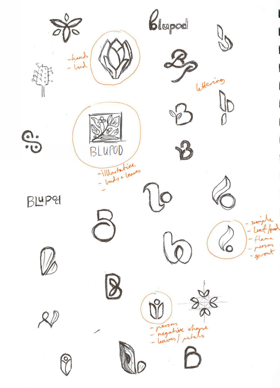
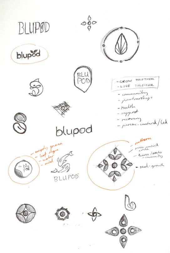
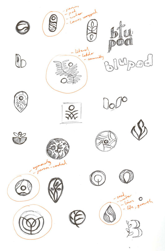
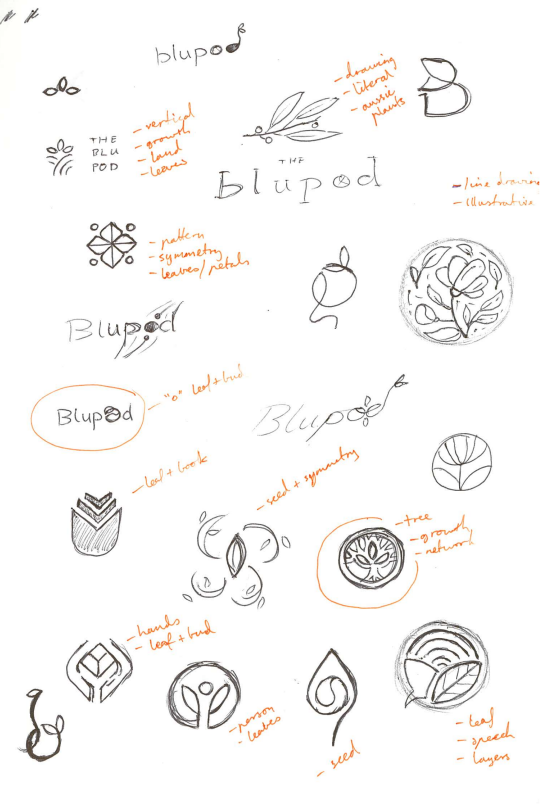
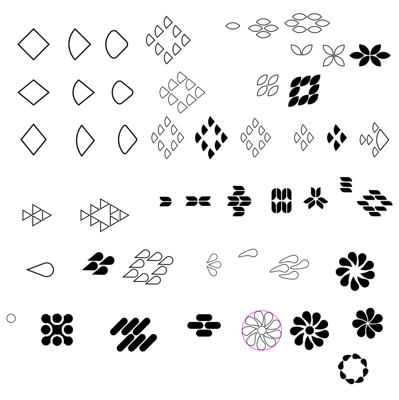
The exploration phase involved multiple concept sketches that symbolised growth and unity—from sprouting plants to flowing waves. I moodboarded soft natural imagery, minimal logos, and contemporary fonts that struck a balance between clarity and friendliness. Early iterations leaned more literal, with leaves and hands, but felt too expected. It wasn’t until I abstracted the idea of a “pod”—not just as a group but a movement in the same direction—that the concept clicked.
I presented three refined directions to the client: one rooted in nature, one abstractly geometric, and one inspired by water-based movement. The client immediately connected with the latter, noting it felt both calming and progressive. From there, we worked together to refine the image mark, focusing on simplicity and symbolism.
Creative Decisions
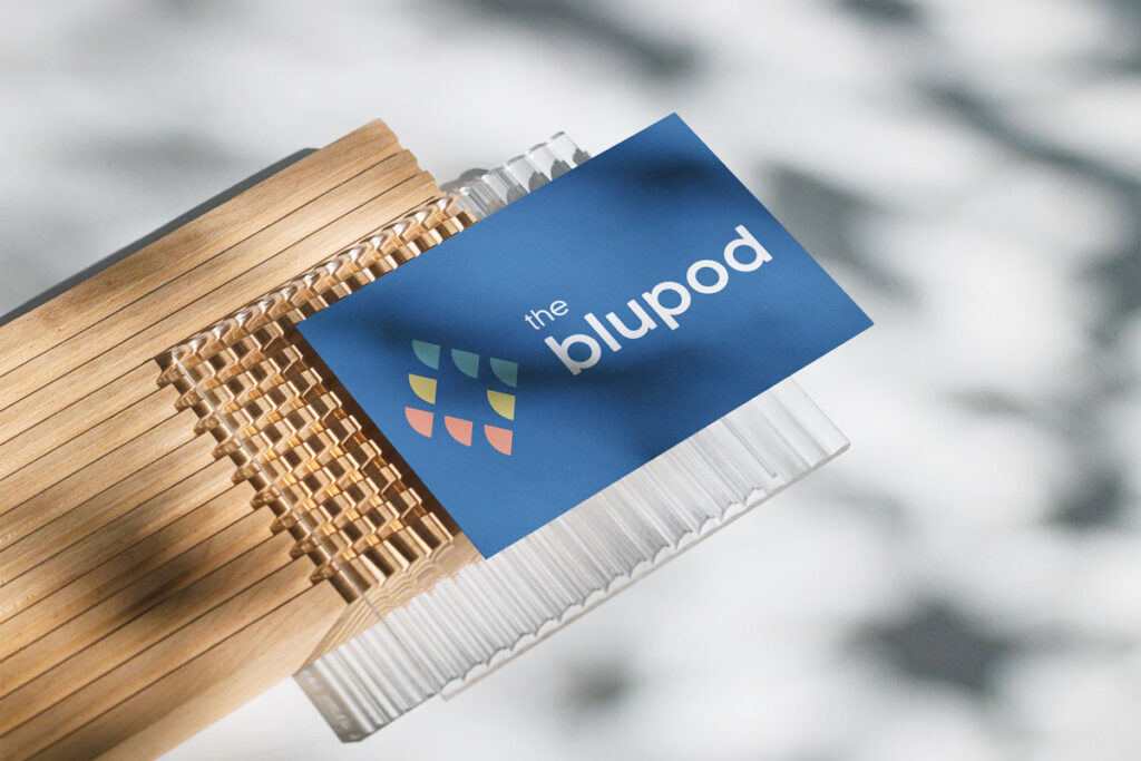
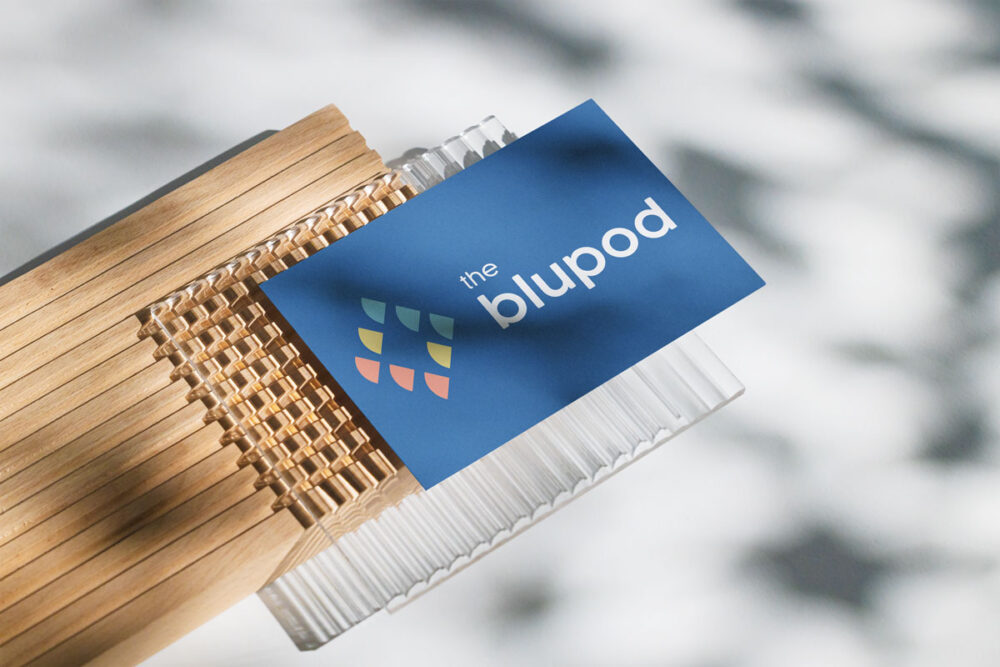
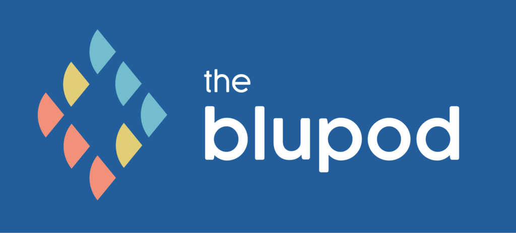
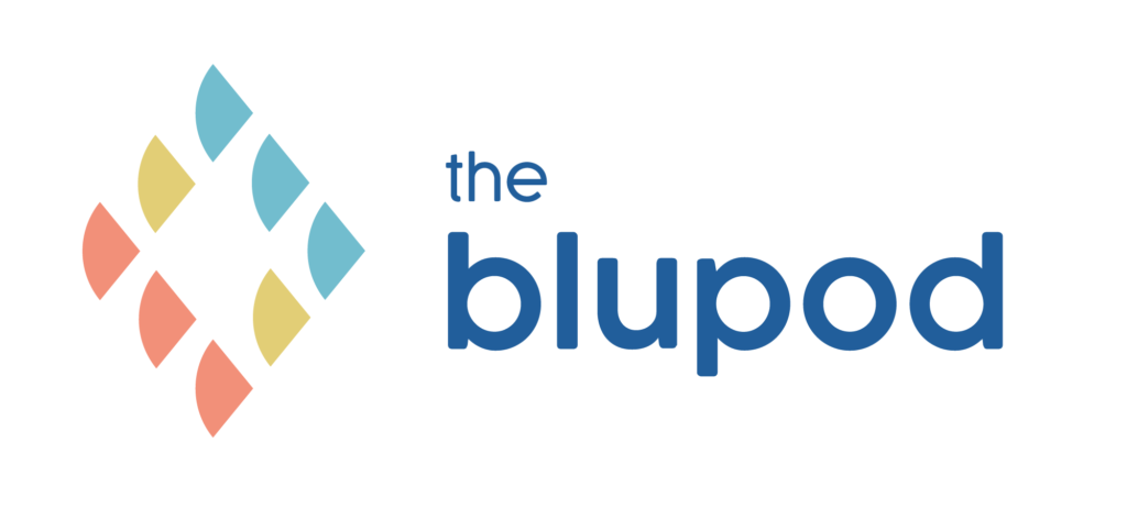
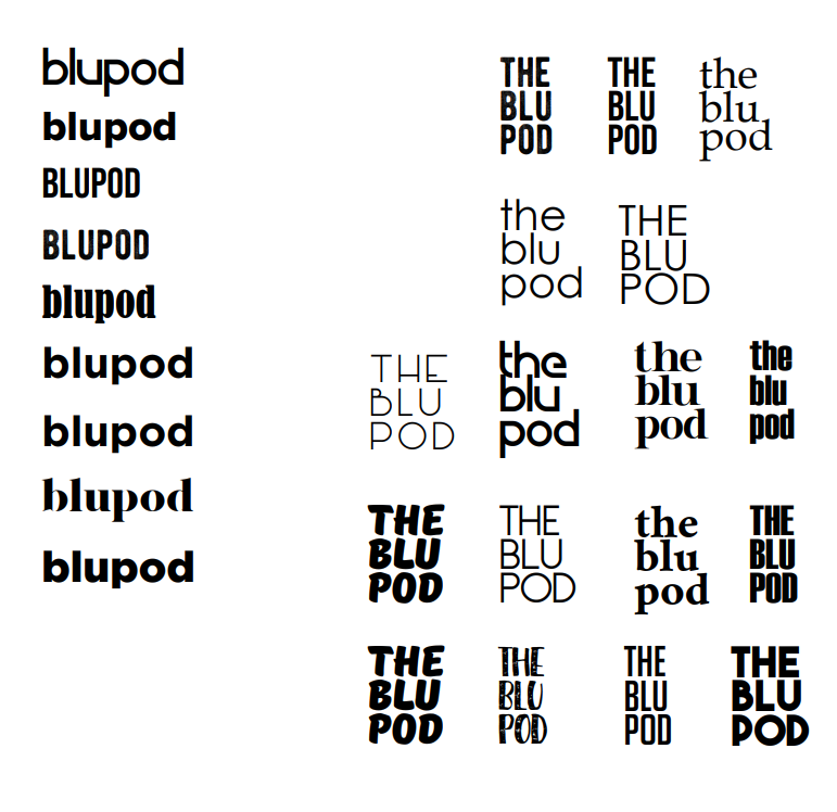
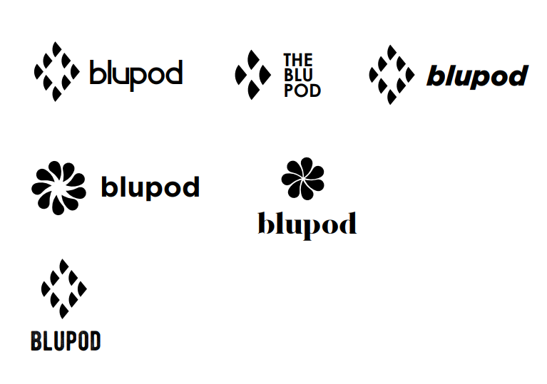
The final logo features an organic, fluid shape resembling a pod or group gently moving forward together—subtle, but intentional. The colour palette uses soft blues and muted pastels, evoking calm and trust without the sterility of traditional medical tones. Rounded sans-serif fonts were chosen for legibility and warmth, further reinforcing the human-centred approach. We avoided anything sharp or overly bold to maintain a sense of emotional safety in the design.
Challenges & Solutions
One of the biggest challenges was finding a visual language that didn’t lean too heavily on overused disability tropes, while still feeling accessible and inclusive. The initial concepts risked being either too abstract or too literal. We overcame this by grounding the identity in metaphor and emotion rather than direct representation. There were also multiple rounds of feedback around tone—specifically how “soft” vs. “professional” the brand should appear. By iterating collaboratively and testing against real use cases (like mock signage and app headers), we found the right balance.
Outcome & Results
The final identity has been well received. The client expressed that it “feels like us,” which is always the most meaningful feedback I can get. Since launch, The Blupod has successfully rolled out the brand across print, social media, and internal documentation. Their team reported that the visuals have helped make onboarding feel more welcoming, and the brand now serves as a unifying symbol for their mission.
Reflection
This project reminded me of the power of subtlety in visual storytelling. As designers, we often aim for standout impact—but here, empathy and quiet strength were more important. I walked away from this project with a deeper appreciation for designing not just for people, but with their lived experience in mind.