UI / UX case study for “Jarviz-ioe Launcher”, a web tool for editing and launching content over a network of devices (such as an office, classroom, display suite or museum).
Skip ahead to the solution HERE
OVERVIEW
“Jarviz-IoE (Internet of Everything) Launcher” is a web tool for editing and launching content over a network of devices.
Role: Lead UX/UI Designer
Client: Get-CSI
Timeline: Feb 2019 – May 2019
Tools: Figma, Adobe XD, InVision, Adobe Photoshop, Google Forms, pen and paper
Process: I adopted the double-diamond strategy for designing Jarviz-ioe Launcher in order to ideate from an objective point of view and to narrow my focus on finding solutions for clearly-defined problems.
Below was the past state of the platform, as you can see it is very bare bones.
COMPETITIVE ANALYSIS
In order to understand both the user and the problem, I began my research by investigating the marketplace for similar apps and services. My research brought a clear understanding of what competition was out there and how it was lacking.
Out of all the content control and launching systems out there, Crestron stood out as the only true competitor, however the systems and technology was rigid and expensive. Other Competitors include Control4, however this was focussed on home environments, and AMX, however this company seems to be leaned towards audio visual specialty. Due to the complexity and specificity of the tool needed, other competitors would only complete a small portion of the tasks required to compete with the Jarviz Launcher, and do not offer the flexibility in device technology, bespoke room control setups and content display or interactivity options.
USER RESEARCH: INTERVIEWS
Due to insights from the survey not giving an indicative direction, possibly from the small sample size, I opted to interview customers who already use the platform in Melbourne, Bendigo and Sydney. I aimed to gain insight into their general attitude to using the web tool, what their pain points were and how much training would be required to educate users to use the tool in its current form.
To properly understand the users, I drafted interview questions with the goal of understanding their attitudes and behaviours, especially in regards to how they go about adding their pre-prepared content into the tool, how they search for content and how easily they define their room or device to launch from.
USER RESEARCH: SHADOW SESSIONS
After rounds of interviews were completed, the next stage was to shadow the users and discover some potential behaviours and pain points that may not have come out in the interviews. We shadowed six users from varied backgrounds for 30 minutes each. We asked the users to perform their usual tasks and discussed a set of pre-planned questions.
We then allocated about 15 minutes for a more complex task that the user may not have been trained for, then discussed the result and their overall experience. All recordings of the users were reviewed for analysis.
KEY INSIGHTS
- The web tool is very intimidating for new users.
- A generation gap exists between people in their early teens such as students versus teachers, trainers and staff members 20 to 30 years older.
- Editing and launching content is usually delegated to the most senior or experienced staff members.
- User needs, methodologies and workload are varied depending on calendar events.
- It’s easy to create content, but users get lost and confused when it comes to launching and assigning content to devices.
- There appears to be a certain level of technology knowledge and basic training before fundamental use of the web tool can begin.
- There is a need for easily accessible video training, print handbooks are frequently lost and forgotten.
- Users expressed a need to continuously add features as technology updates along with software and hardware.
CHALLENGES
Interview insights revealed that some ideas and functions originally cited provided to me in the project brief were confusing for the users.
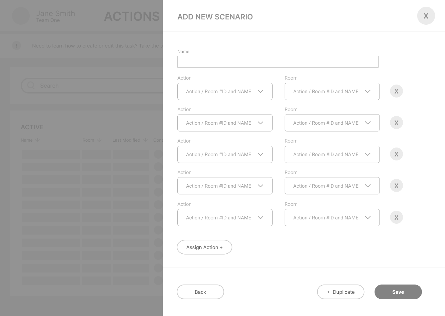
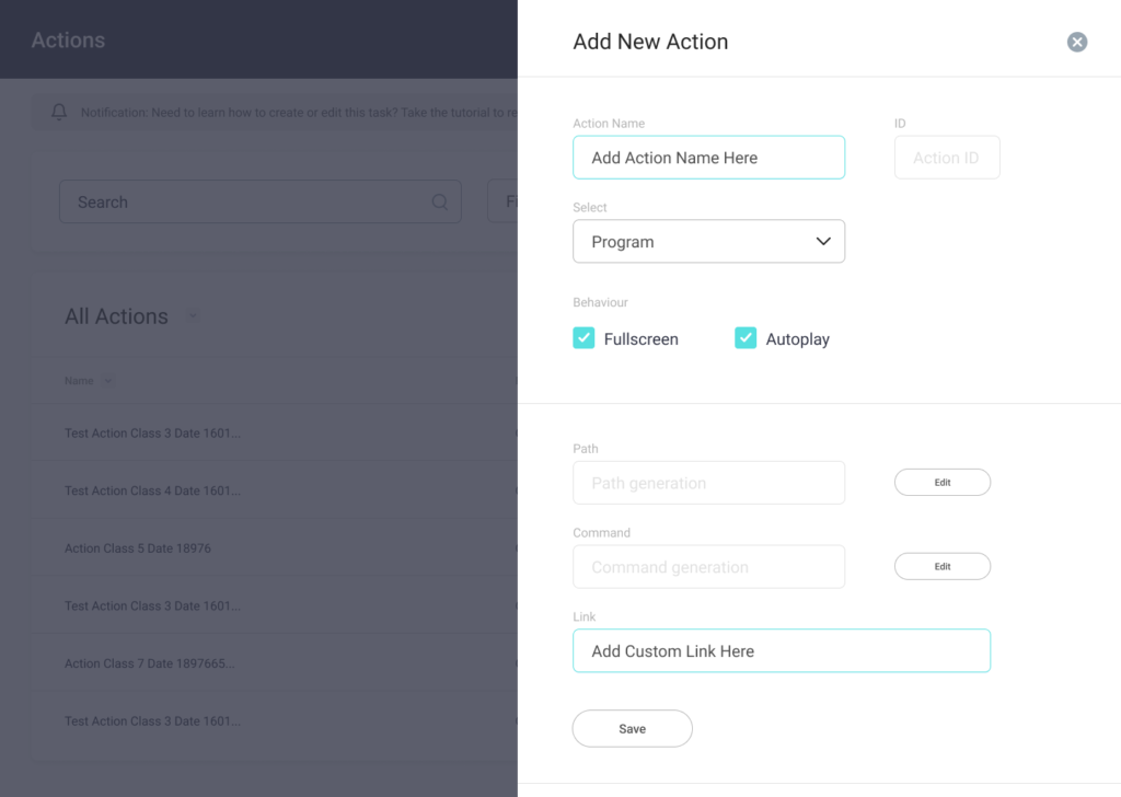
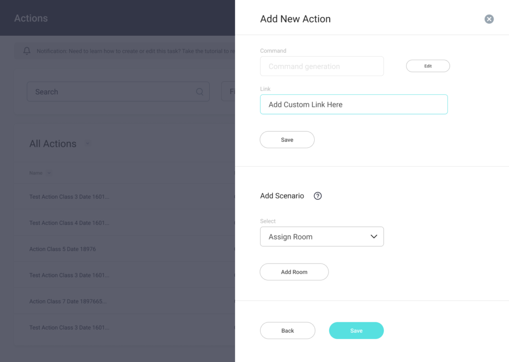
The project brief specifically called for adding “Actions” and “Scenarios” for the user to select or edit their content and launch it, this would make up the “Action”. Then the user needed to move to the next step of assigning a specified “action” to a device or group of devices, making a “scenario”.
This proved to be confusing, not only in the naming conventions but the hierarchy in terms of user flow, it is not clear which step should be taken and when, it is also not completely clear what fields or buttons should be interacted with, or edited or not.
An additional challenge also arose when we found that users who were not IT savvy had a very tough time even grasping the concepts needed to think about how, when and where to launch their content. These users would need additional IT basic training or would need to delegate to their nominated staff member for each room/office/suite.
Another aspect that proved to be challenging from the developer side was that each task could be performed independently and be assigned to something else, requiring independence from other tasks. for example, I can create an action than could be assigned to multiple rooms or just a single device, or i could create multiple rooms with the same device and so on. This means that the primary task screens cannot change or become merged to simplify the design process.
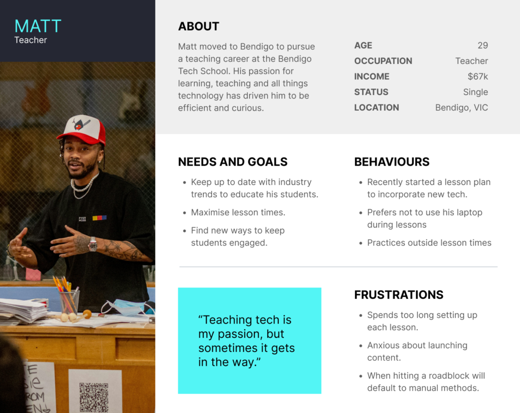
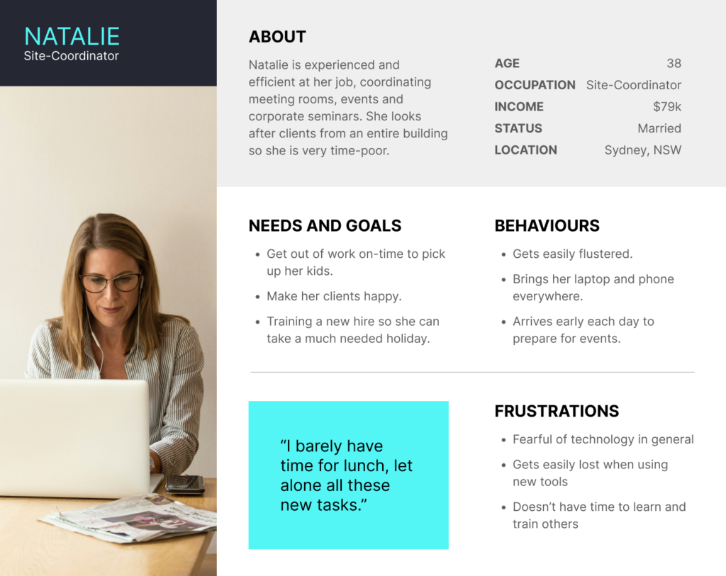
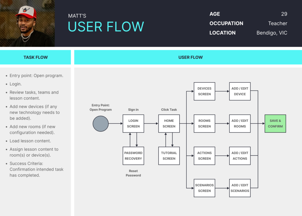
USER PERSONAS
Synthesizing the insights from the interviews and data collected from shadow sessions, I created two primary personas to put a human face on the different user types I discerned: Matt the teacher and Natalie the Site-coordinator.
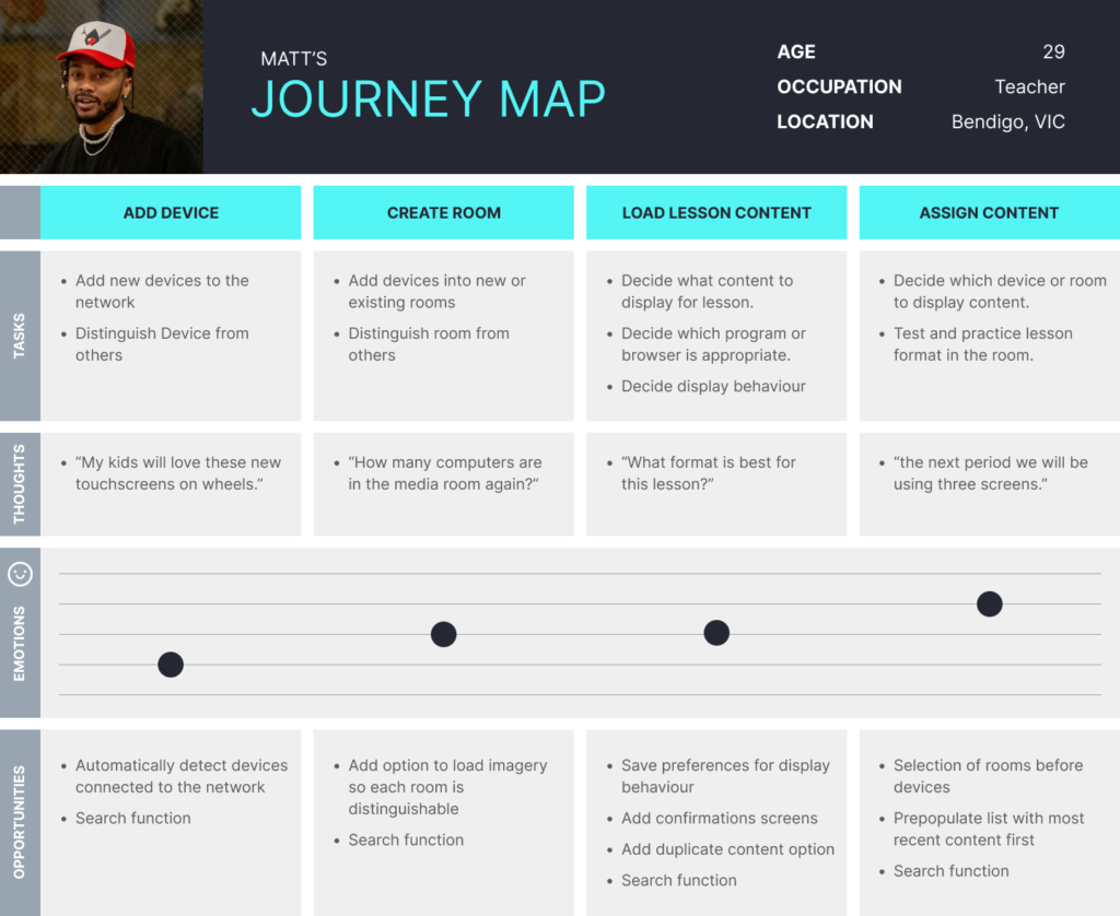
USER JOURNEYS AND FLOWS
To envision what functionalities would be needed to meet the most pressing needs of my personas, and how they would feel while doing so, I created user journeys based on the personas and their respective goals.
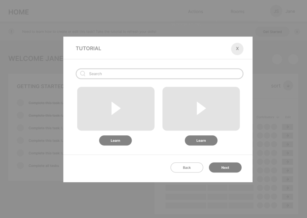
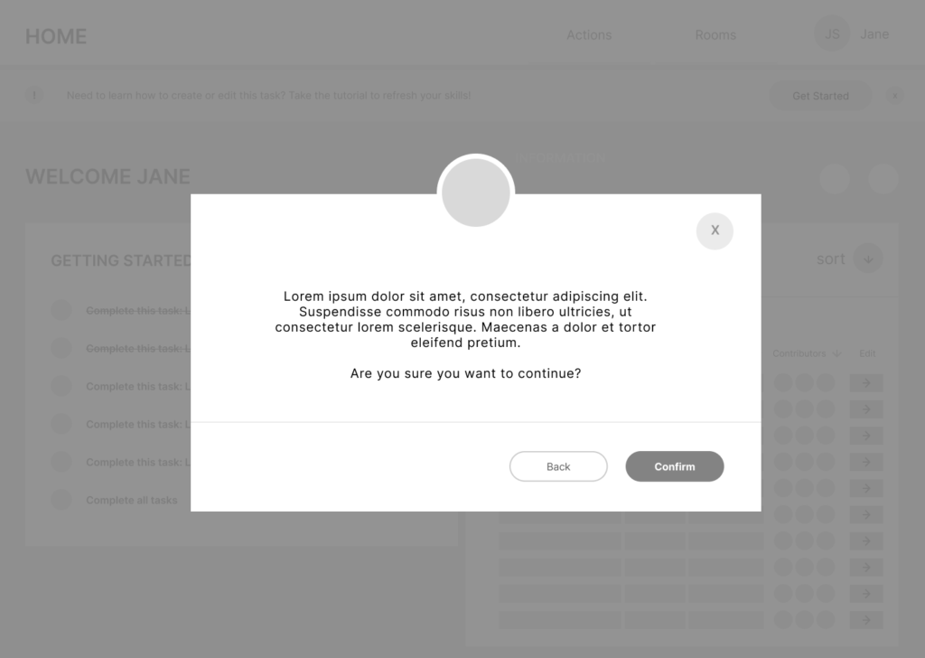
Both Matt and Natalie are having trouble performing tasks within the tool smoothly and have limited time to perform tasks. There is a need for a tutorial screen to refer to if the user forgets how to perform the task. Also a need for confirmation screens and a more guided experience is required so they do not become lost and frustrated.
DEFINING THE PROBLEM
Problem Statement: Jarviz Launcher users spend too long searching for content and re-learning how to navigate tasks, rather than completing them. The hierarchy of tasks is also not clear, leaving the users to be lost, especially when not using the tool regularly. Users are prone to making mistakes that can undo their previous tasks.
Proposed Solution: Implement a way for users to easily navigate to their chosen task, to re-learn how to complete the task ways to find and edit existing tasks, and develop a way to significantly reduce failure rates.
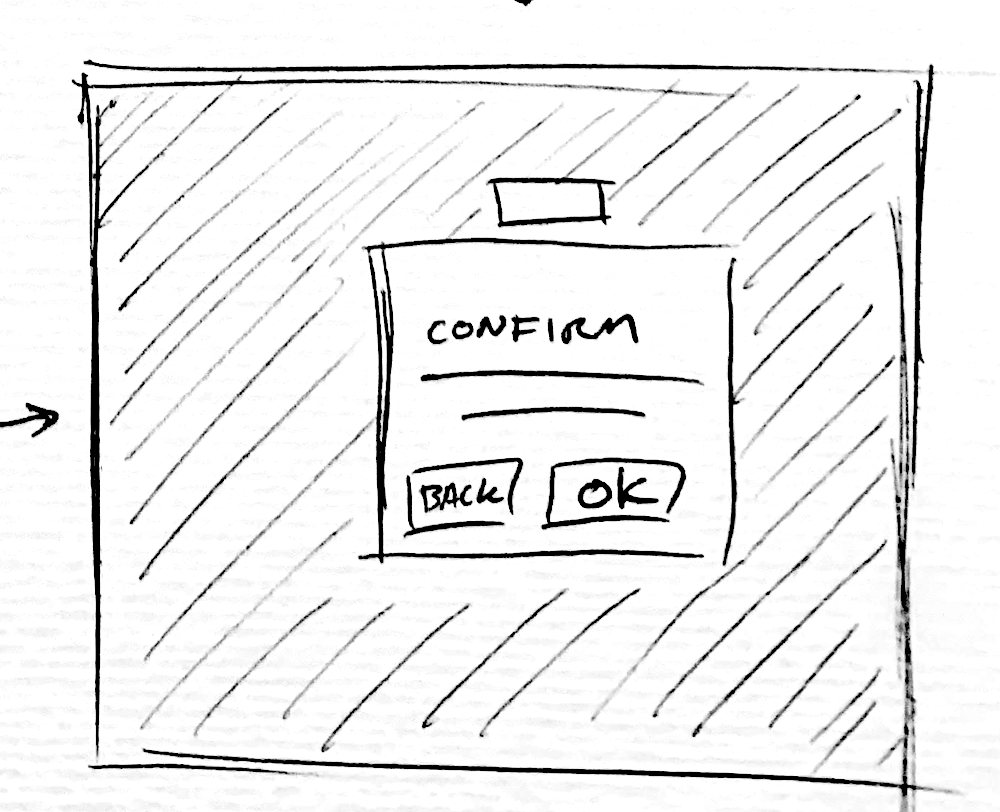
WIREFRAMING
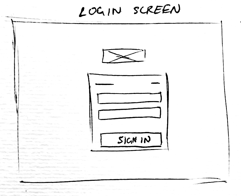
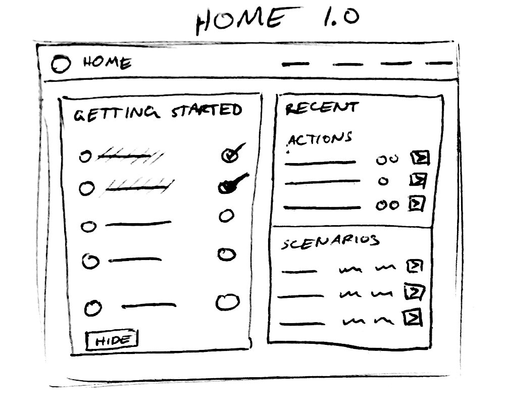
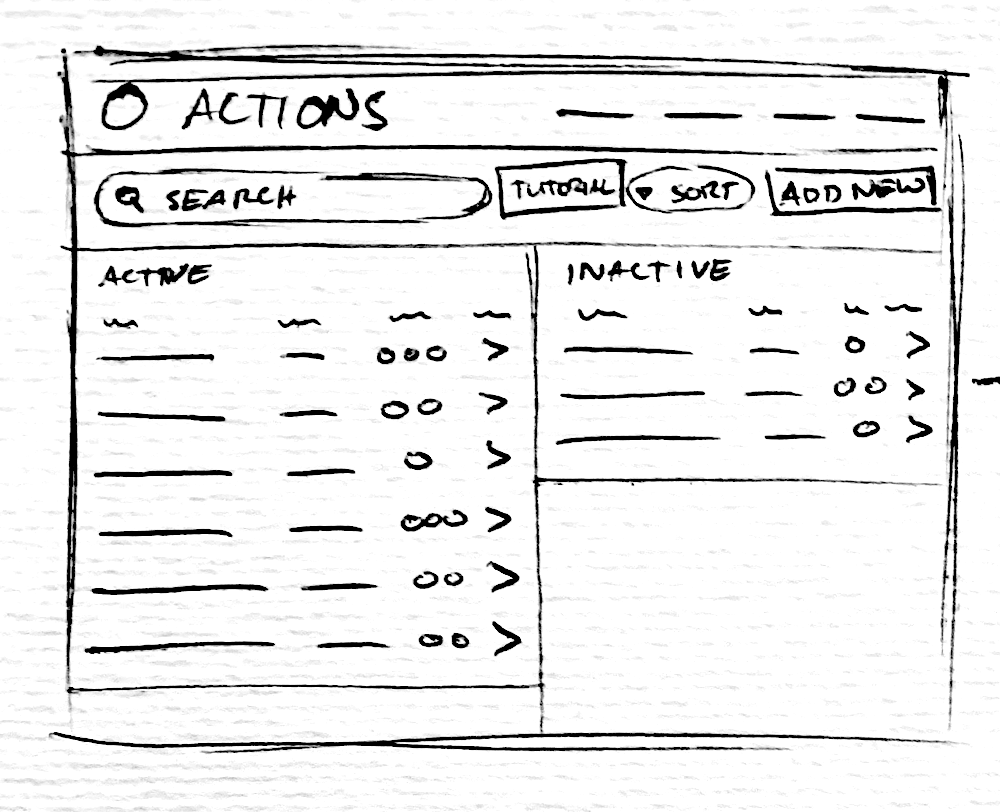
With a modified sitemap on hand, I began sketching the lowest of low fidelity wireframes on a notepad. Once satisfied with the paper sketches, I moved onto mid-fidelity ideations in Figma.
Low Fidelity
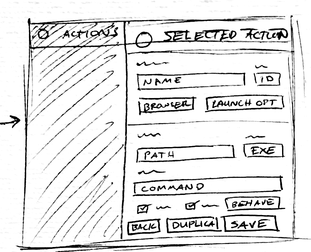
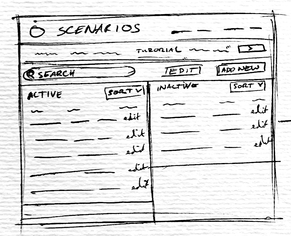
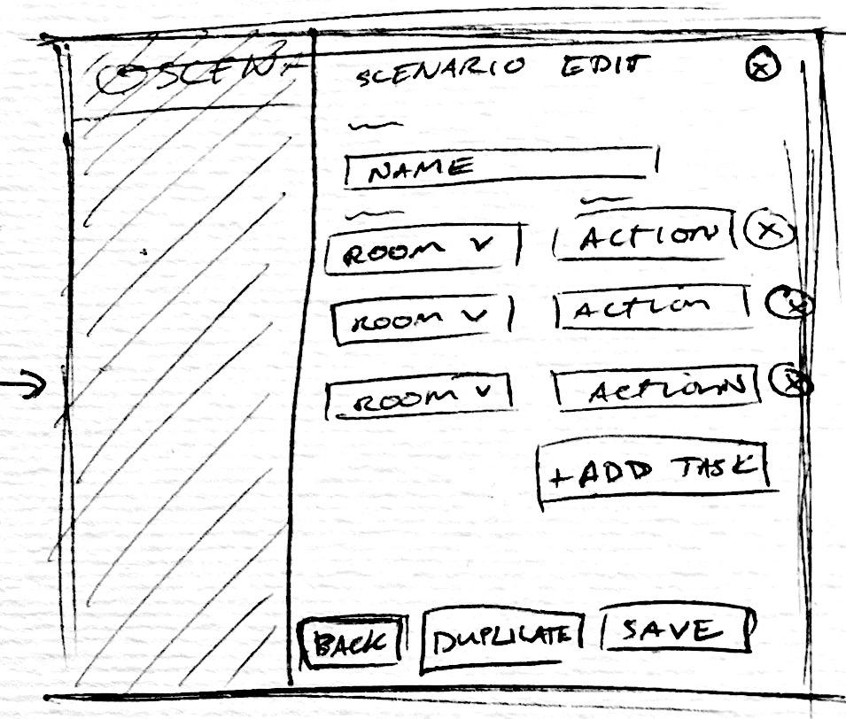
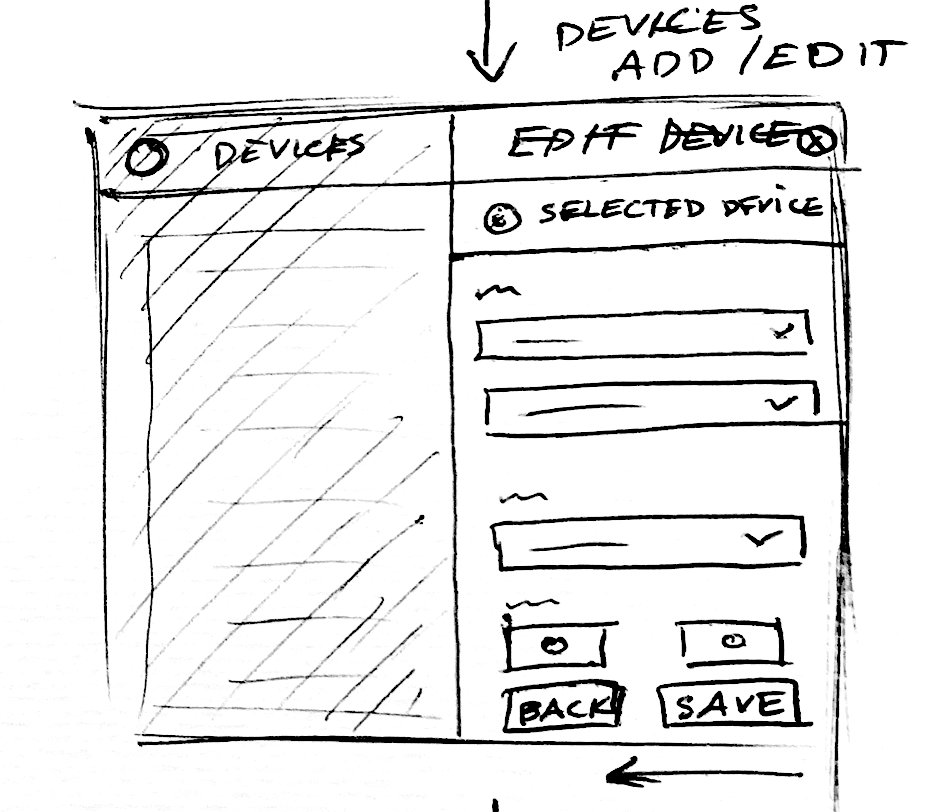
Medium Fidelity
USABILITY TESTING
GOAL
The main goal for the Jarviz-ioe Launcher Usability Test was to assess the platform’s learnability to see how quickly and easily participants could accomplish the directed tasks, and to note the frequency and severity of user errors.
TEST OBJECTIVES
• To learn how easy it is for users to complete “add new” tasks.
• To learn how easy it is for users to save their progress.
• To determine whether users can successfully search for their content / device / room.
• To determine if the user satisfaction when completing or failing tasks, and what they like/dislike about the experience.
METHODOLOGY
I conducted moderated remote tests online. Each participant was asked open-ended questions regarding their initial thoughts of the platform and its purpose. We then asked the users their primary tasks discussed with their team leader before being tasked with scenarios where they used the Jarviz-ioe Launcher to complete dummy tasks mimicking a real world event.
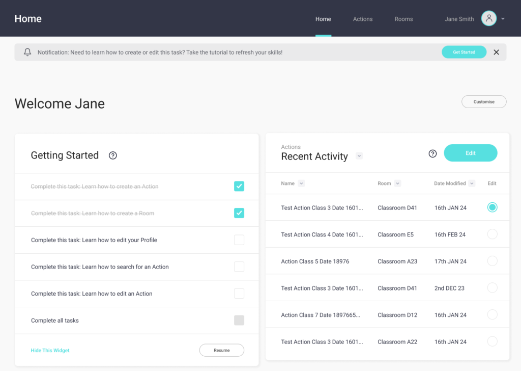
CONCLUSION
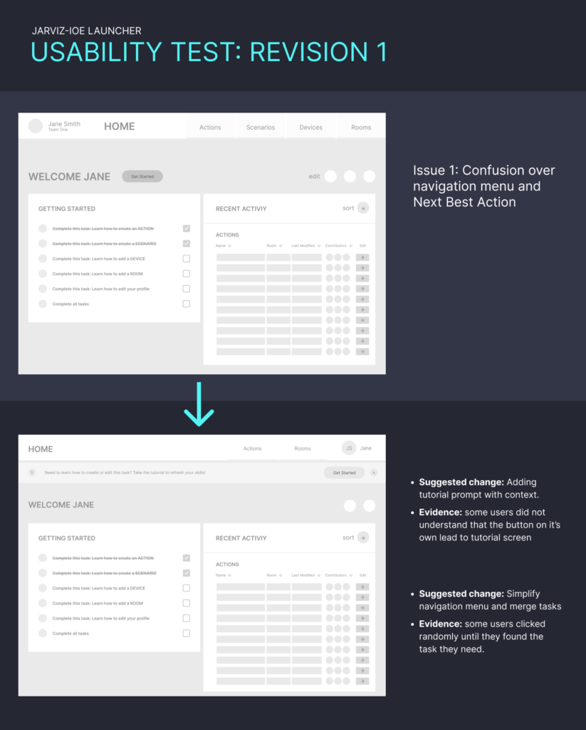
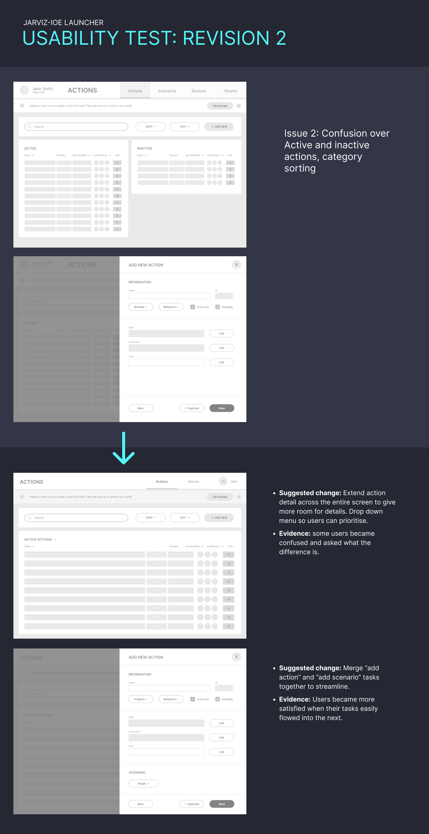
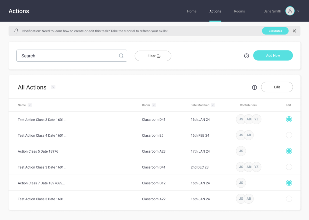
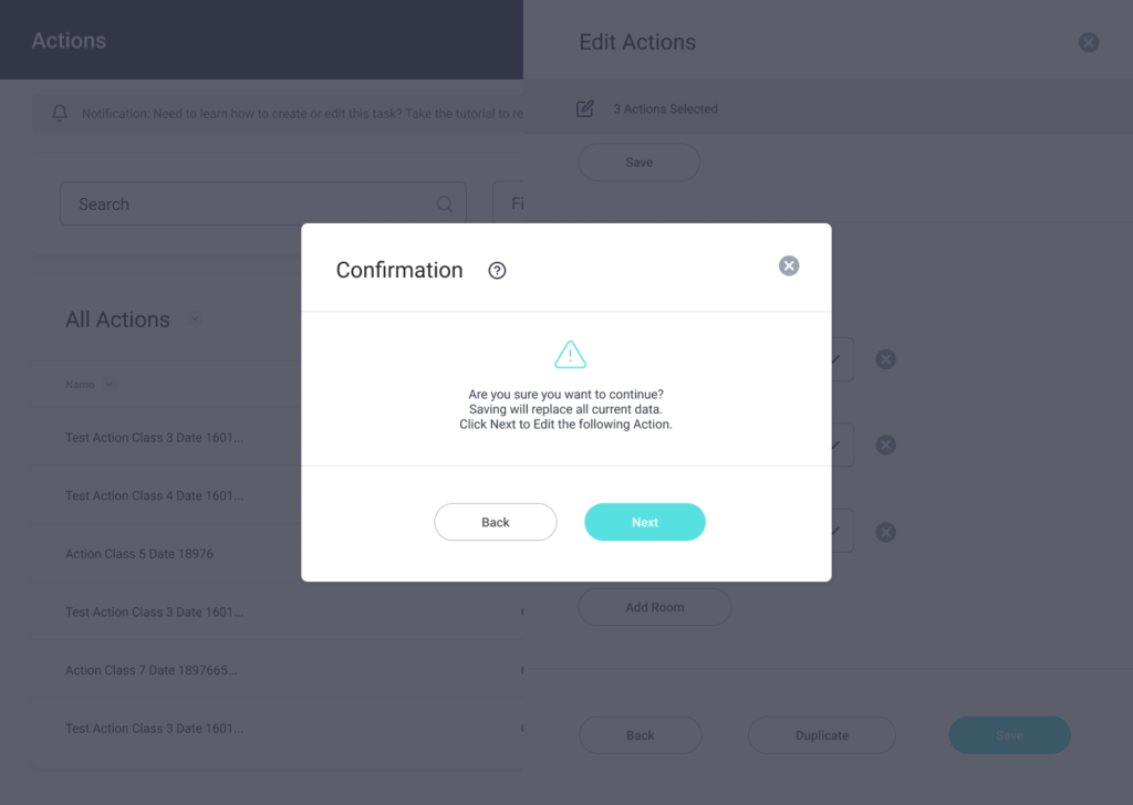
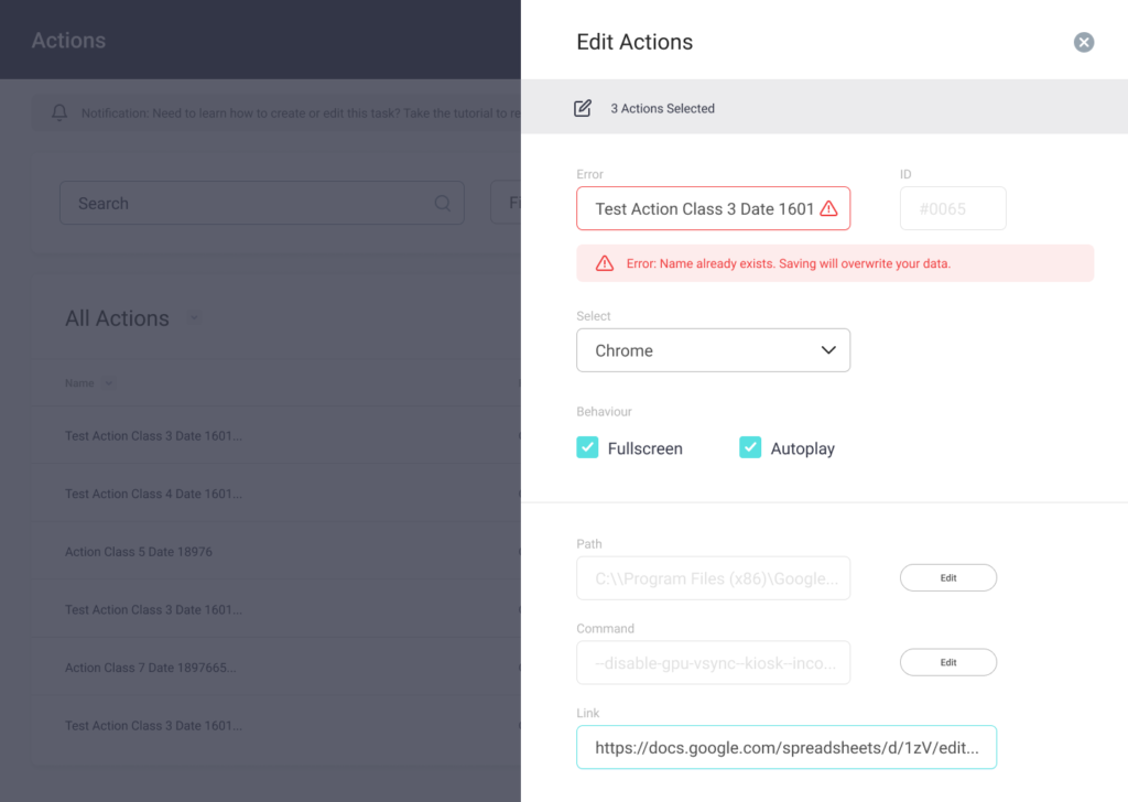
Most Jarviz-ioe users found the platform attractive and well laid out, however some who were not IT-savvy found it unintuitive and became lost after a small number of tasks. Participants were generally able to add/edit “actions” and “scenarios” but still became confused when tasked with creating a “room” or adding a “device”.
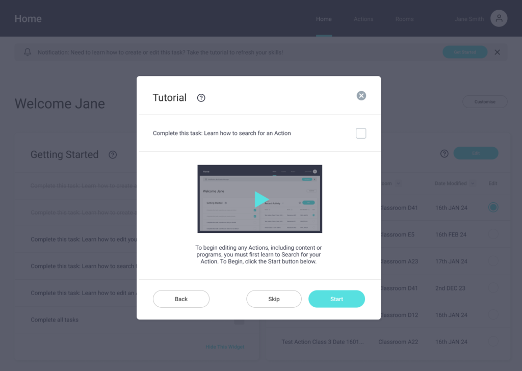
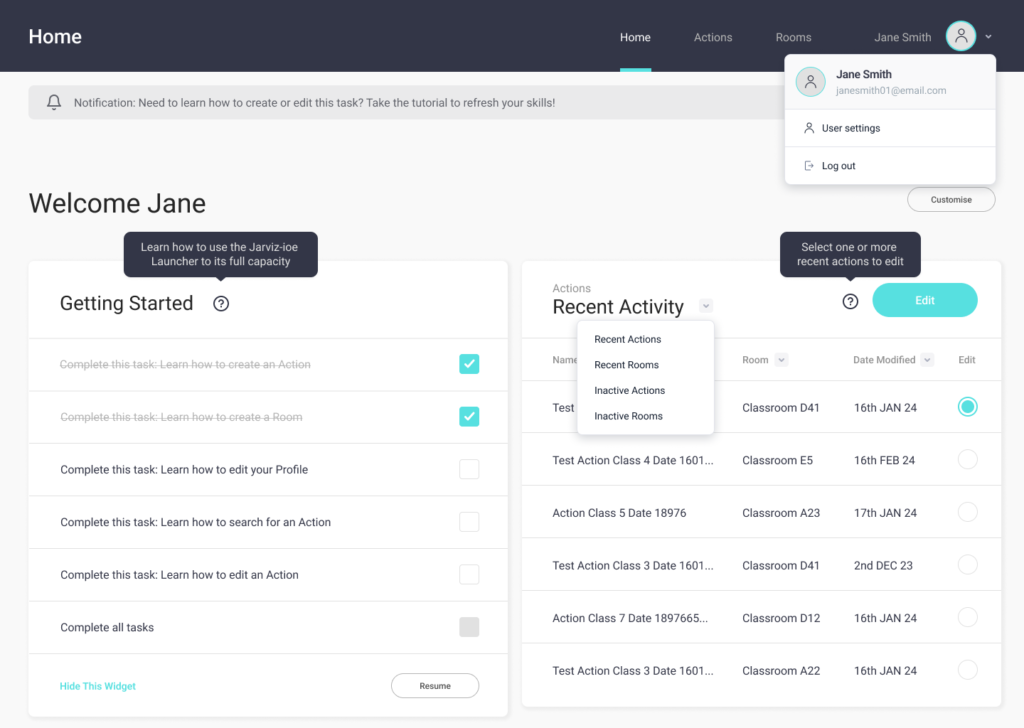
This has prompted another round of wireframes to simplify the tasks to make it clearer to the users where and when to take the next action. We also added a tutorial screen and confirmation message to reduce task failure and increase clarity.
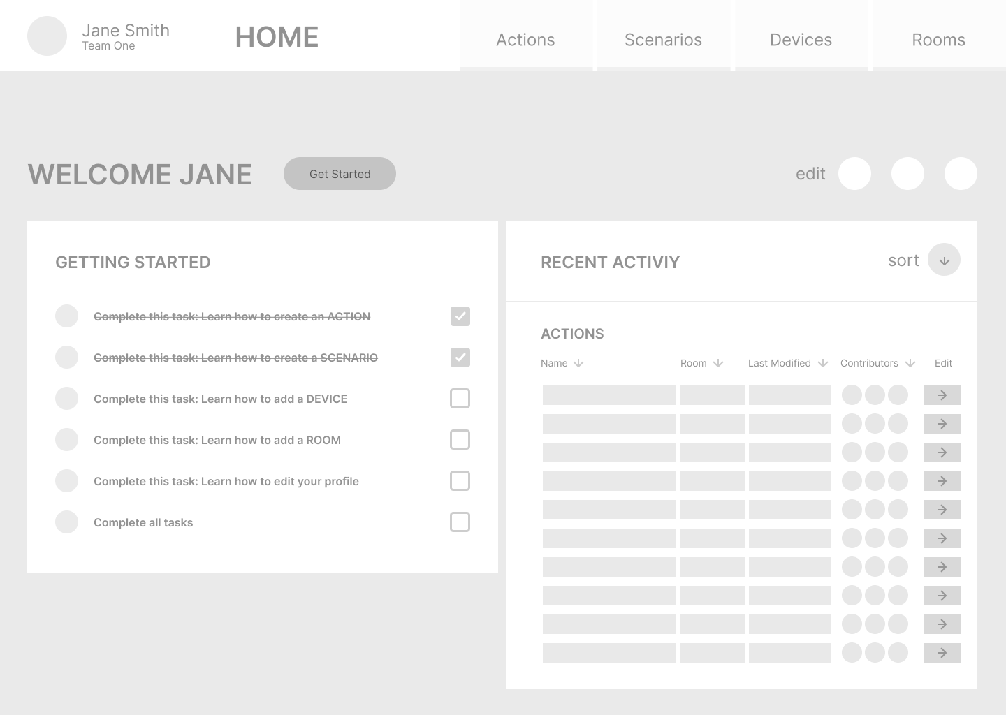
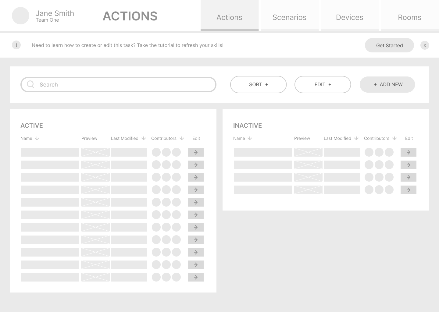
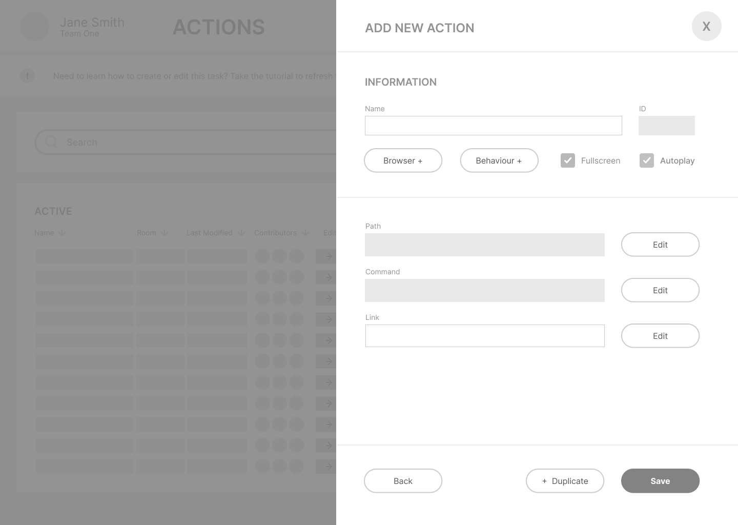
Medium Fidelity – Revised Wireframes
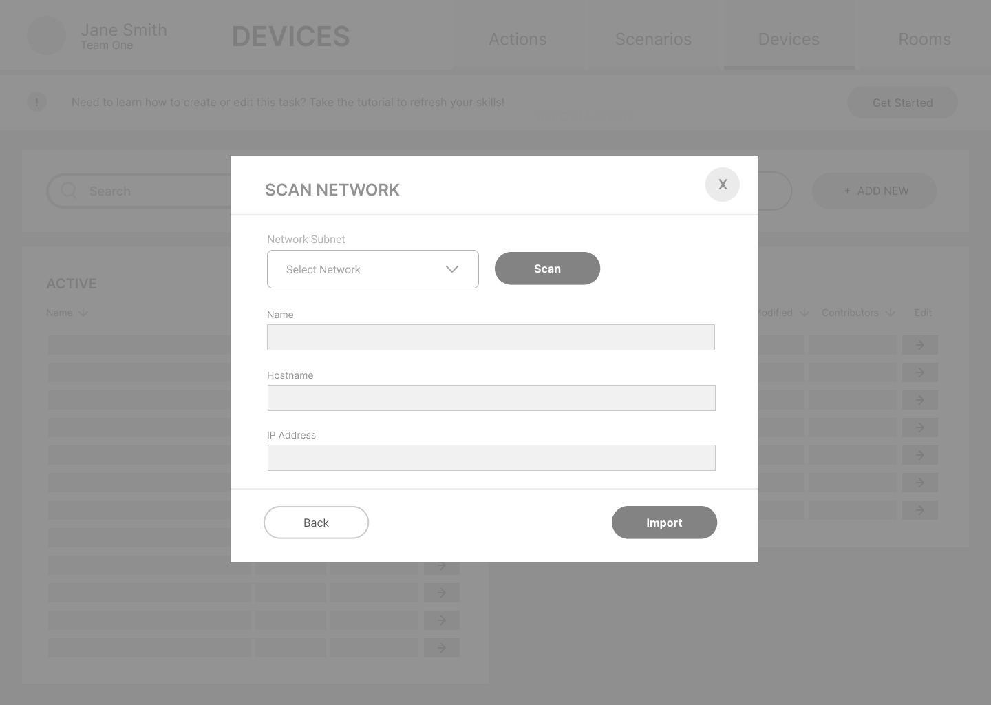
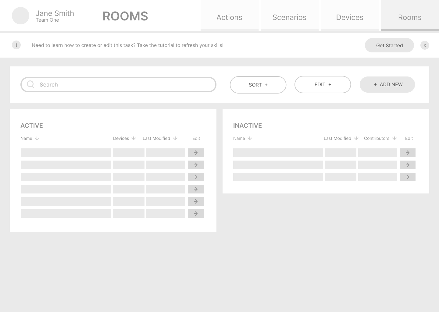
HIGH FIDELITY WIREFRAMING
Following the usability testing and subsequent changes, I made some more refinements based on the Google Material Guidelines, grids and accessibility compliance. I also needed to consider the product branding that was already existing.

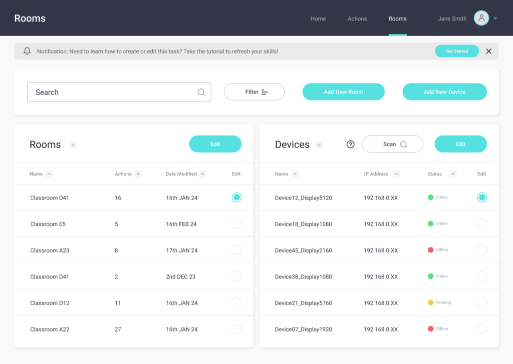
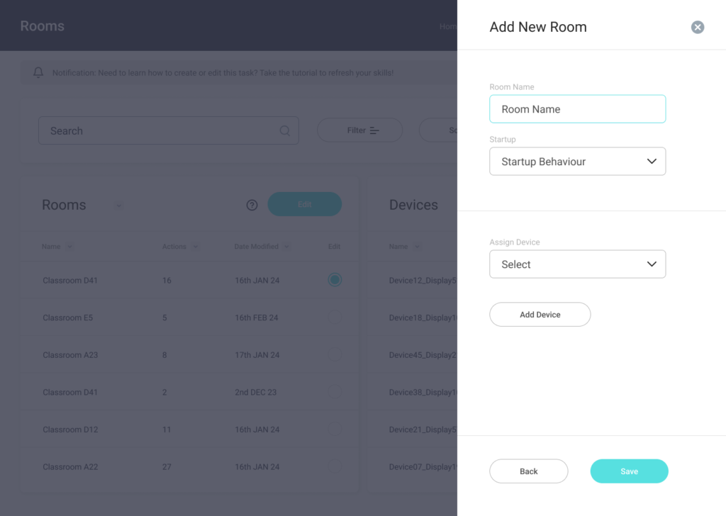
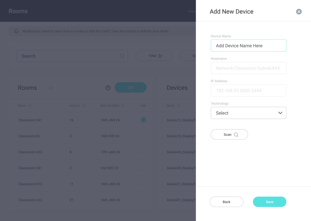
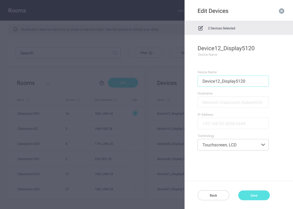
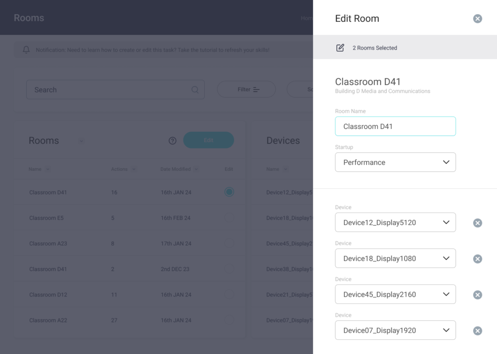
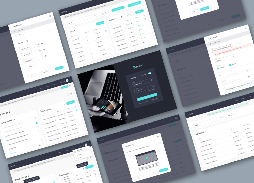
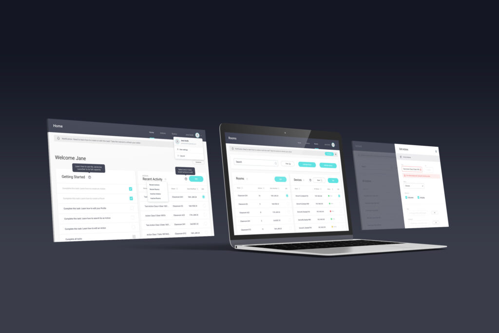
PROTOTYPE
Play with the Prototype by clicking this LINK
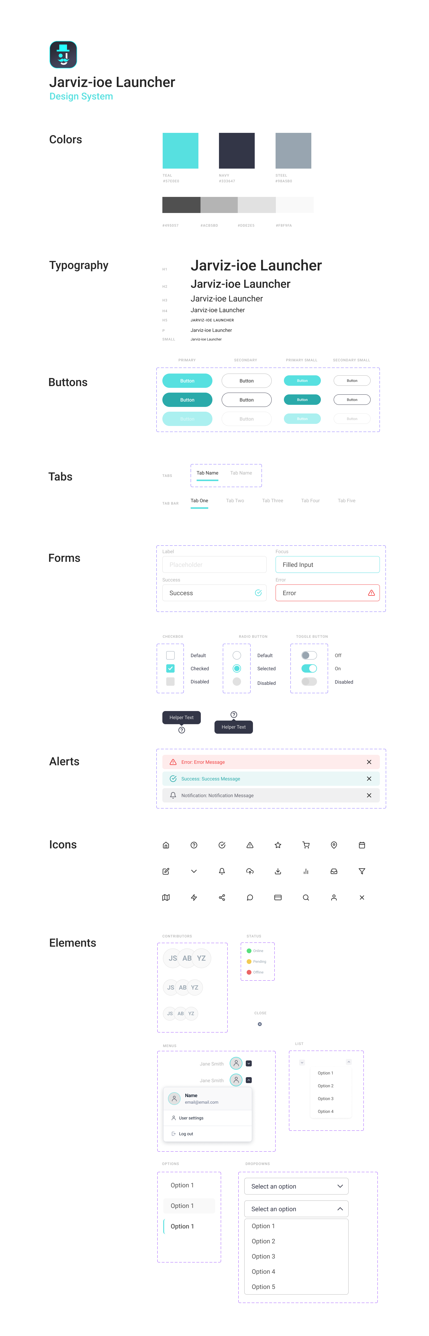
DESIGN SYSTEM
RESULTS
After Jarviz-ioe Launcher was launched for our customers in Melbourne, Bendigo and Sydney, I conducted short interviews with regular users of the platform. The overall sentiment was significantly improved customer satisfaction, reduced failure rates and confusion, and all of our interviewees commented on the improved look and feel.
The addition of guided tutorials was the most impactful improvement for users who were not confident with technology, and for more tech savvy users the addition of confirmation windows and notification bars allowed them to understand each action they took which put them at ease as they used the platform over longer periods of time.
Some input fields still confuse newer users, however this was tackled with training sessions, or in future, could potentially call for a more user-friendly version of the platform that limits functionality if it becomes too overly complex for new customers, however this would require a fair bit of additional development.
The improved Jarviz-ioe Launcher platform was used across all our collaboration technology sites in Australia from 2019 to 2023.