Graphic Design case study for “ABBA Day Downunder”, an event launched in Melbourne for all things ABBA. Workshops, dancing, performances and networking.
Skip ahead to the solution HERE
OVERVIEW
“ABBA Day Downunder” is an all day event run by ABBA enthusiasts and non-profits to bring people together under the umbrella of one of the most influential supergroups the world has ever known.
Role: Graphic Designer
Client: The Equality Project – Lead non-profit group responsible for pulling the event together
Timeline: Mar 2024 – May 2024
Tools: Figma, Adobe Photoshop, Adobe Illustrator, Canva, pen and paper
Process: Firstly I set out to understand the problem, gathered data, meet with clients and event organisers to get a picture of what the target audience was, and what the stakeholders were looking for. I cross-referenced with the design brief and began initial ideation, sketches and mockups. Once the art direction was approved I moved on to push out the required event graphics, social media tiles, printed materials and other collateral needed for the marketing campaigns.
THE PROBLEM
From the outset of the project there were some limitations and challenges, these are outlined below:
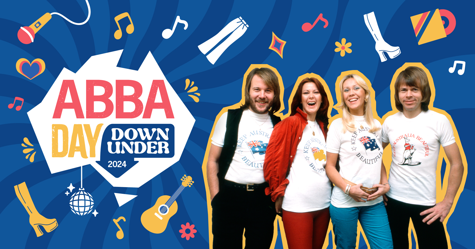
- The client expressed the requirement to use a licensed photo of the group to be used throughout the marketing materials, however the license cost was too high so this price was still under negotiation when I started on the project.
- The look and feel should reflect the experience on the day of the bright, fun, nostalgic and accessible for all ages.
- This led to the next challenge which was to create an art direction that would work with or without this chosen photo.
- Another detail was the client wished to create a level of consistency across all platforms and image sizes.
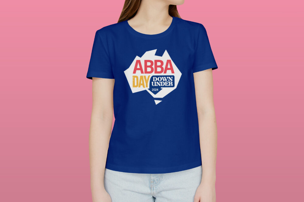
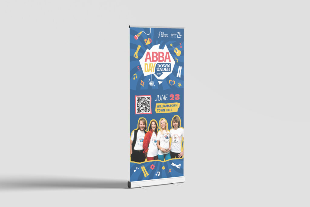
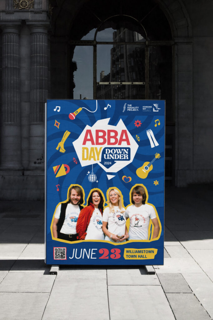
- Fonts, colours and images were required to work on a range of digital and print materials – some of which included T-shirts, tote-bags, pull up banners, badges and more.
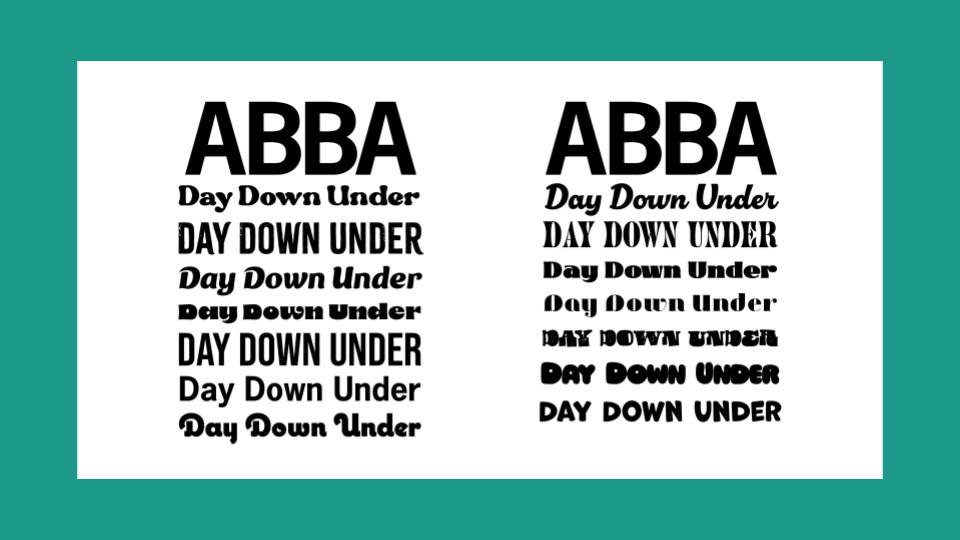
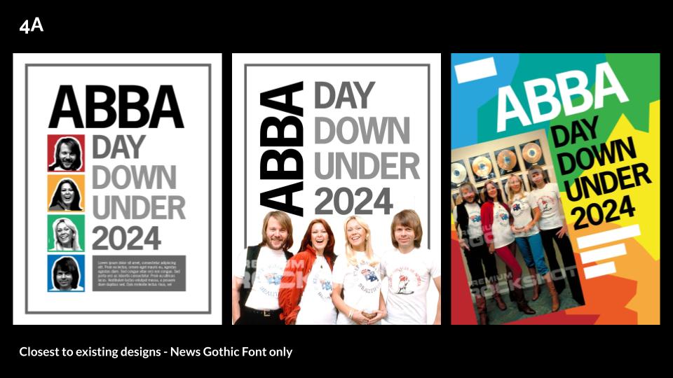
- Font restriction was the “ABBA” text needed to be the same as the original ABBA group logo font.
- The time frame was limited as print proof were required to be sent to suppliers within two weeks.
IDEATION
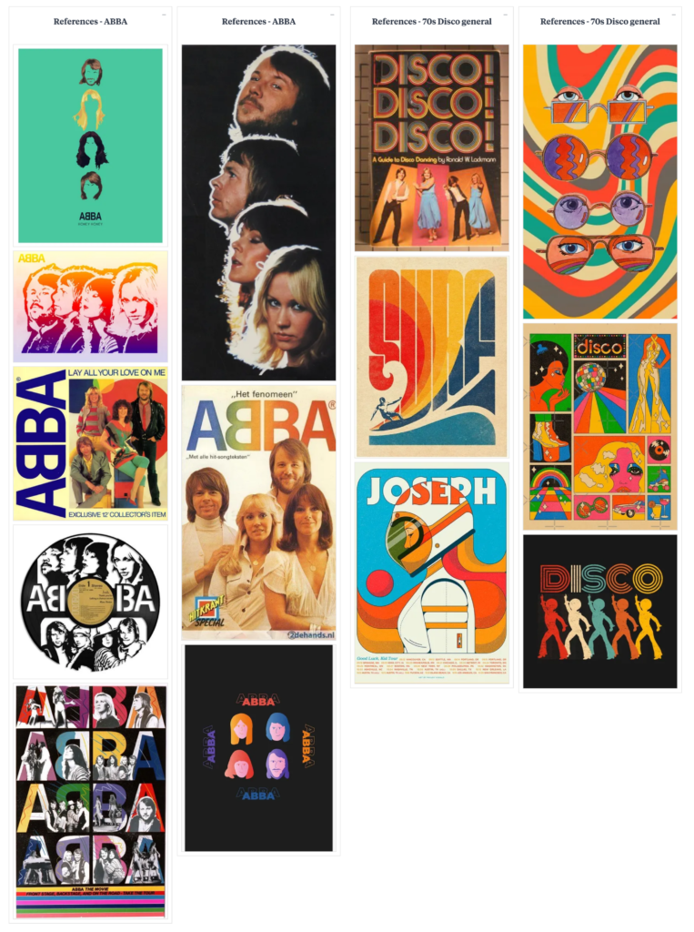
After initial meetings with the client and stakeholders I produced some outline of requirements, considerations and learnings, as well as a mood board for reference. Some initial ideas were completed by the client to give me an idea of what they were thinking.
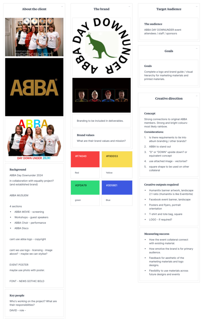
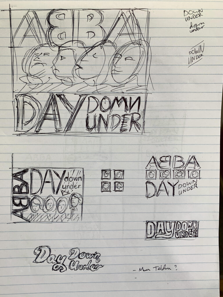
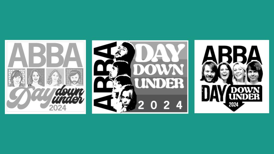
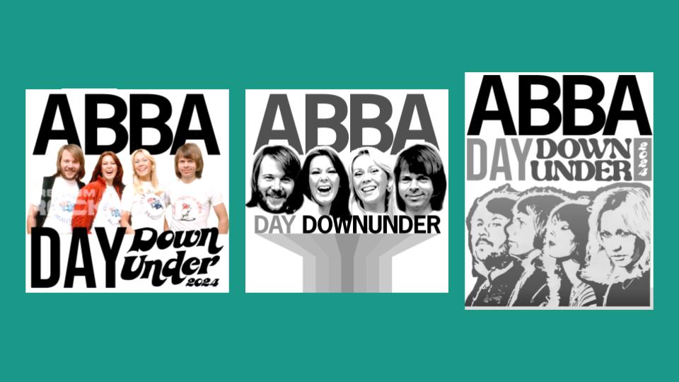
I began with sketches and rough drawings of layout and font ideas, primarily in a poster format while keeping in mind the desire to reduce to a wordmark or logo for smaller sizes.
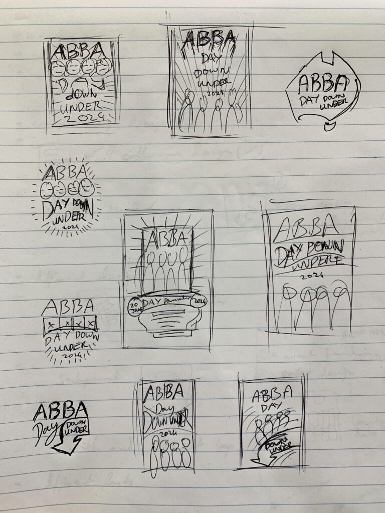
I then produced some medium fidelity mockups for the client to approve. These included font exploration, layout options and colour choices.
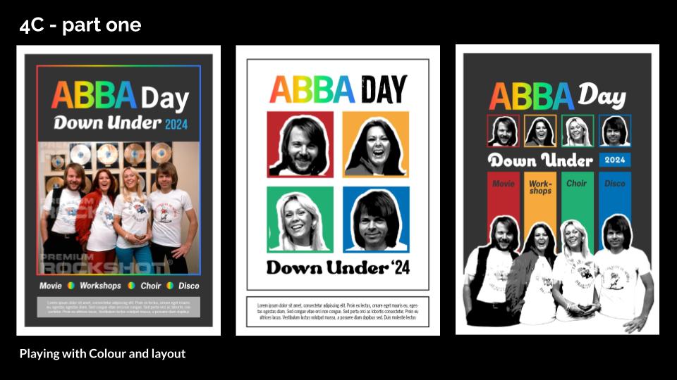
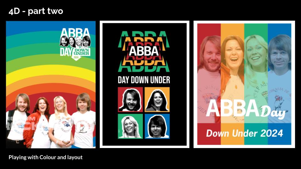
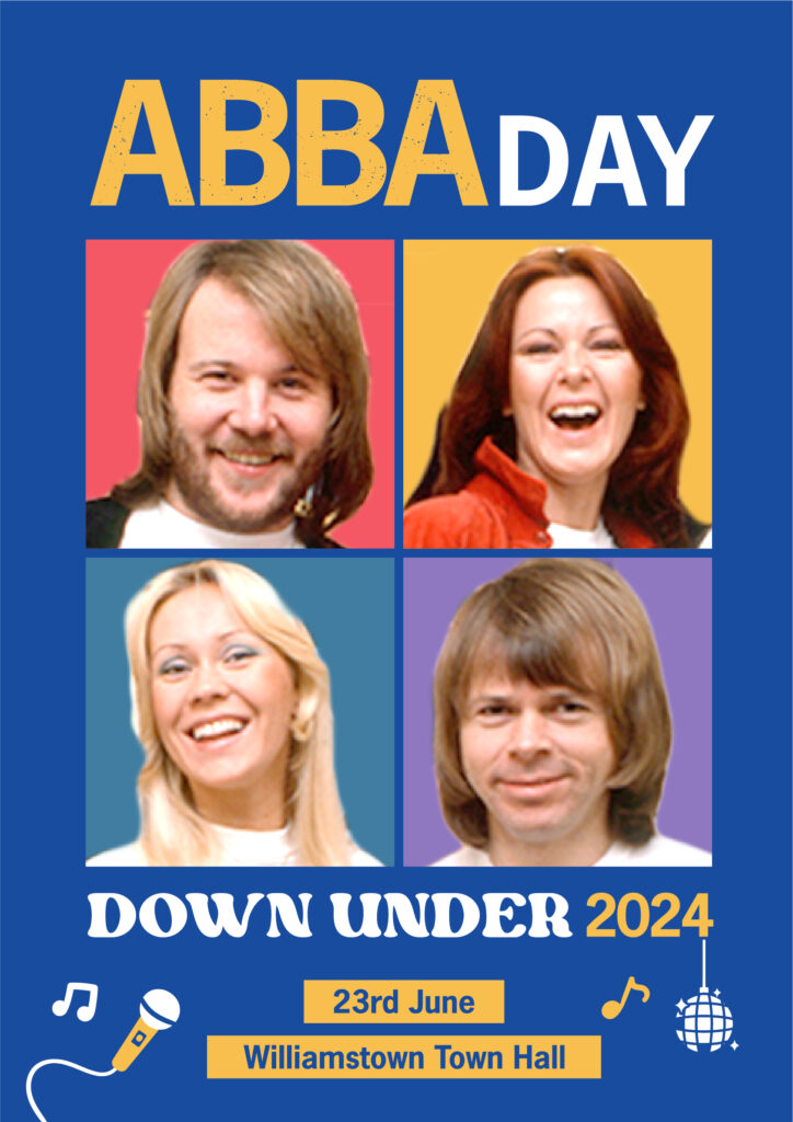
I met with all clients and stakeholders once more and went over the final requirements and status of the pending licensed image. We decided on a direction so I mocked up some final drafts in both blue and yellow.
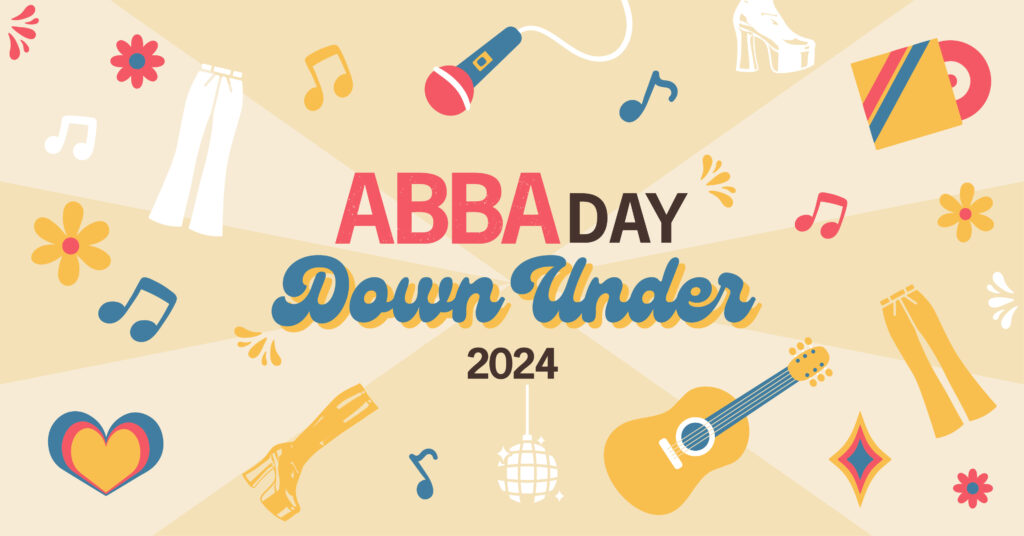
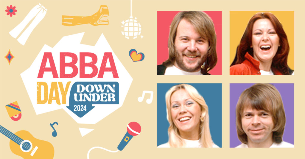
PRODUCTION
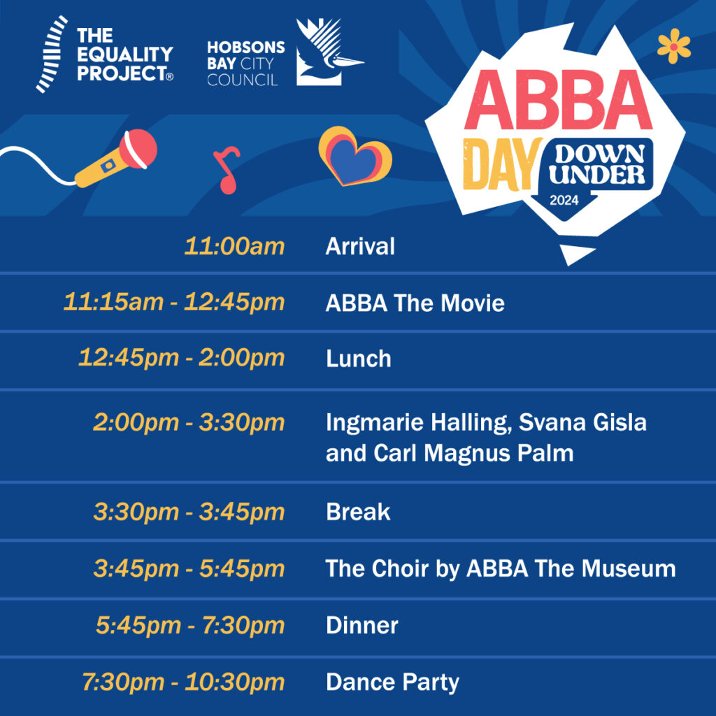
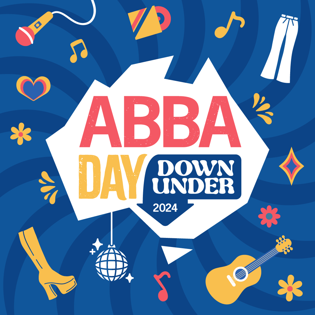
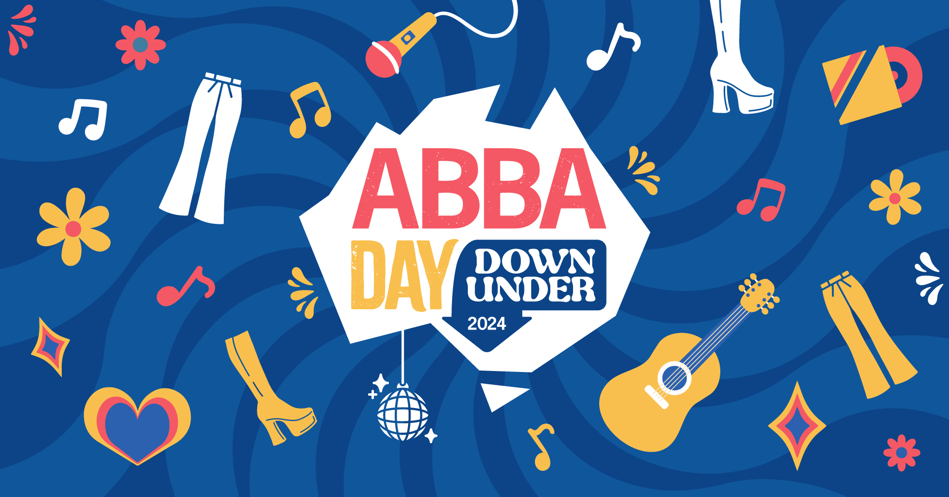
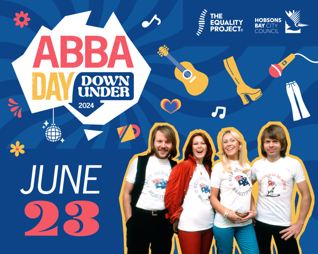
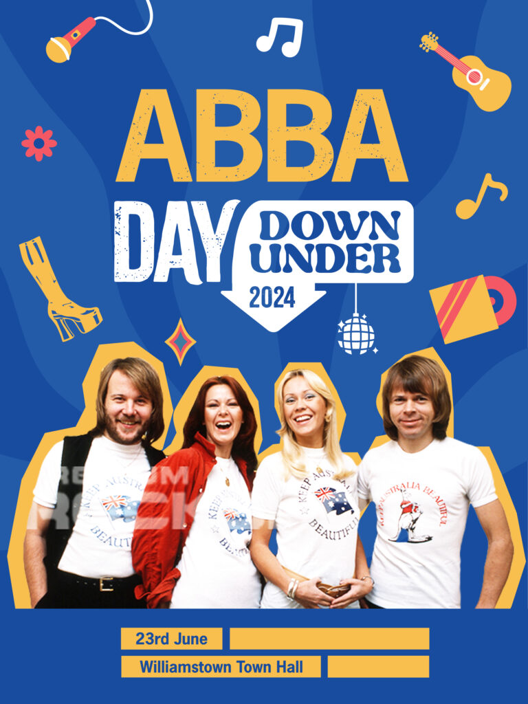
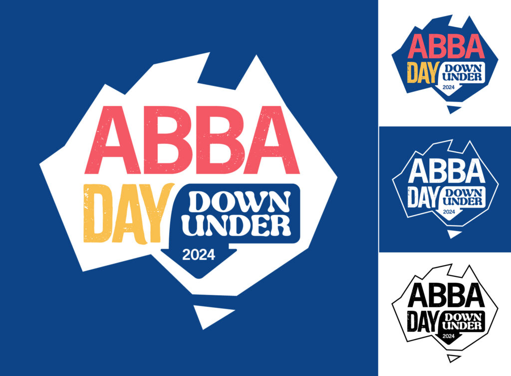
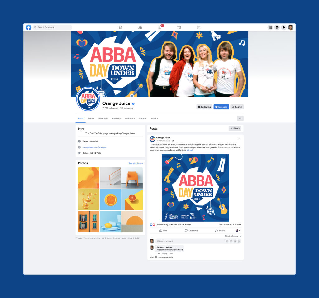
Now the time came to push all the various materials out. The specifications of which depended on the venue, screen sizes, social media platform or print material. First set of outputs was the “logo” to be used across social media profiles, badges, and shared with event partners to use on their own marketing collateral.
Overall the client was happy with the outcomes, we definitely hit the brief and came up with something that was very striking and recognisable, and would allow for iterations in the following years. The colours also were a nod to the original ABBA supergroup as they were from Sweden and used many blues and yellows in their album covers and outfits.
A key for me in the fast turnaround was the willingness of the client to open up and let go of some ideas to embrace others if it would benefit their program. We ended up far away from what the client had in their minds aesthetically, but by working closely together we were able to produce a range of assets that suited the original brief much more strongly.
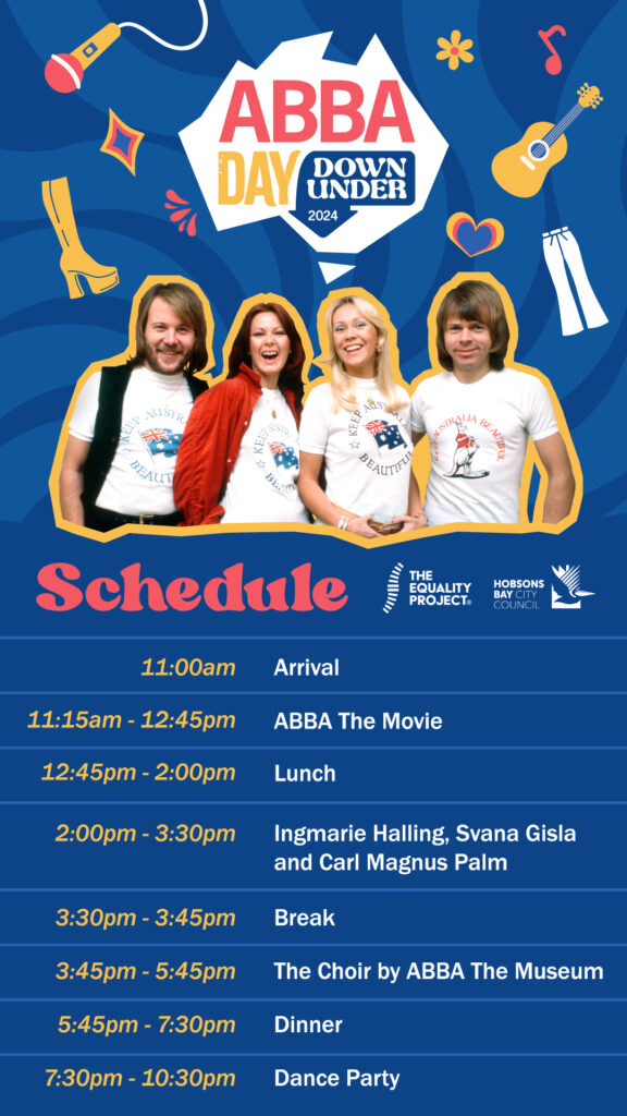
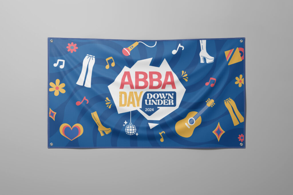
Next was the printed materials including posters and banners of various sizes.

Followed by the remaining digital assets thereafter.