Project Overview
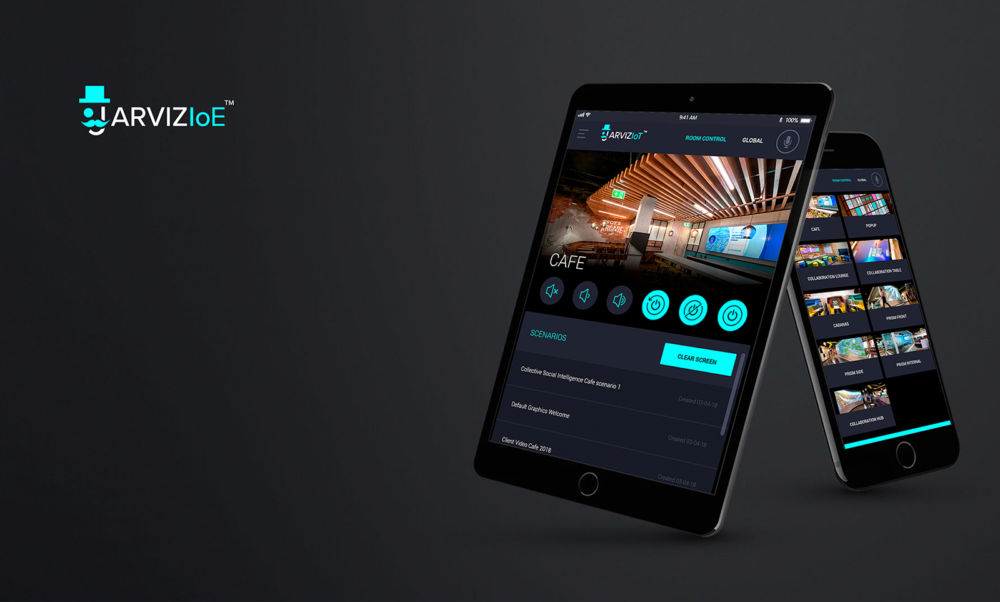
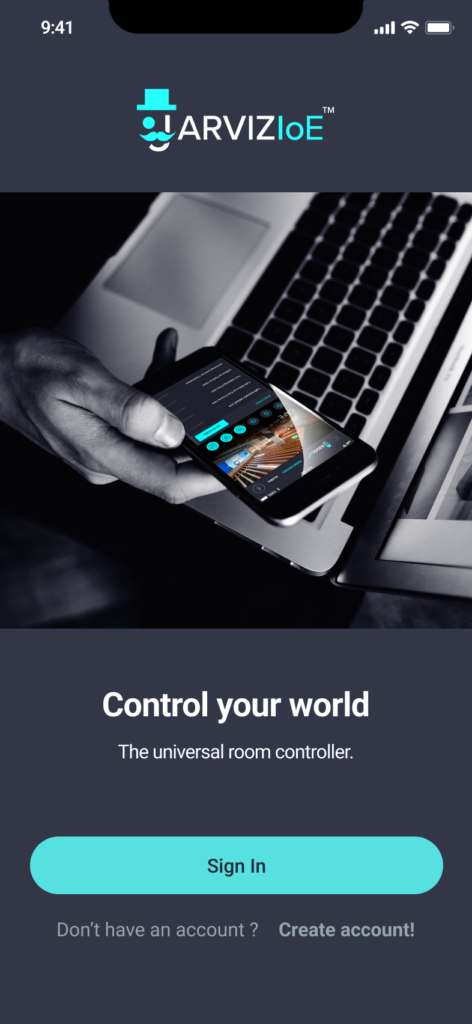
Jarviz-IoE (Internet of Everything) is a universal room control app developed by Get-CSI, designed to allow users to control everything in a room, floor, or building—from lights and blinds to frosted glass, displays, PCs, and even bespoke programs. It integrates closely with Get-CSI’s backend platform, the Jarviz-IoE Launcher, which sends content and device instructions directly to the app.
The app was being used in high-tech workspaces, innovation hubs, and corporate boardrooms, requiring a polished interface and strong reliability. As the Lead UX/UI Designer, I was responsible for redesigning the user experience, creating a clear interaction flow, and modernising the visual identity of the platform.
My responsibilities extended to brand design, product websites, marketing videos, training materials, and overseeing on-site client onboarding in New York, Sydney, and Bendigo.
- Role: Lead UX/UI Designer
- Client: Get-CSI
- Timeline: UX/UI Phase (Aug – Dec 2018) | Full Project (Mar – Dec 2018)
- Tools Used: Figma, Adobe XD, Photoshop, Google Forms, pen and paper
Background & Challenge
When I first joined Get-CSI, I helped launch the early version of the Jarviz app. At that time, my focus was largely visual—delivering an interface that looked sharp and on-brand. However, this version lacked the functional depth and user focus needed for long-term scalability.
As the product gained adoption, pain points emerged rapidly. Users found the experience frustrating, unintuitive, and inconsistent. Some of the most serious challenges included:
- High rates of user error, particularly with global vs room-level controls
- Inefficient content discovery (e.g. scrolling through endless menus)
- Poor affordances and unclear button functions
- Lack of voice feedback—leading users to believe features were broken
- Interface fatigue due to unclear hierarchy and menu structure
This project became an opportunity to reimagine Jarviz from the ground up—this time with user experience at the centre.
Approach & Strategy
I adopted the Double Diamond design process, a proven UX methodology for problem-solving:
1. Discover
Conduct research to understand user behaviours, frustrations, and needs
2. Define
Synthesize research into clear problem statements and feature priorities
3. Develop
Explore ideas, sketch solutions, and build wireframes and prototypes
4. Deliver
Test, refine, and launch a production-ready interface with full rollout support
This process allowed us to go wide in research, then narrow our focus on validated design opportunities.
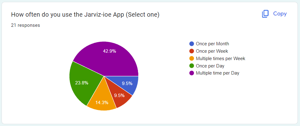
Research: Interviews & Surveys
To move from assumptions to facts, I launched the first formal user research initiative for Jarviz. This included:
- Interviews with experienced and new users
- On-site observation of users interacting with the app in real environments
- Quantitative surveys distributed via Google Forms
- Support ticket reviews to gather anecdotal feedback from IT teams
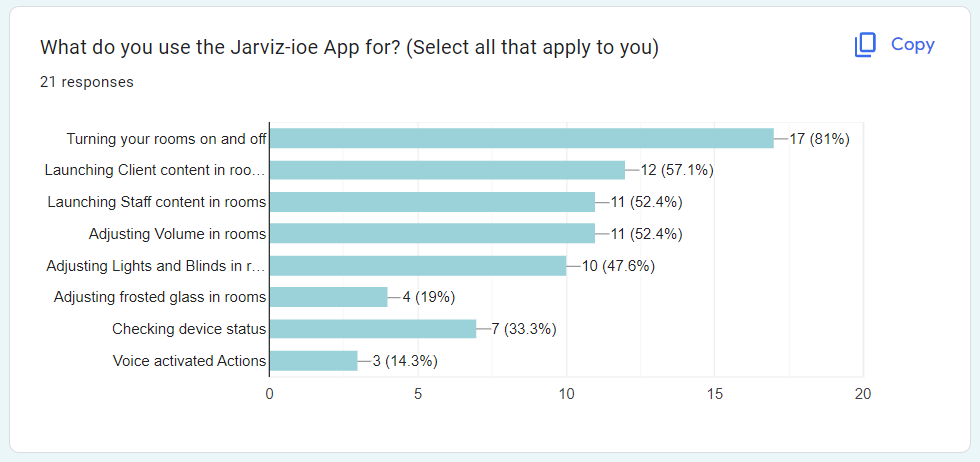
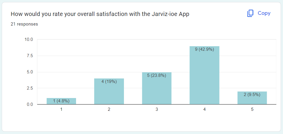
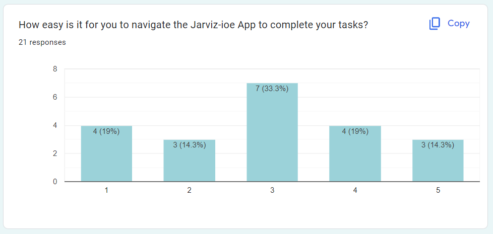
Survey Highlights
The survey included both multiple-choice questions and open-ended responses. The most common pain points were:
- “I often press the wrong button.”
- “It takes too long to find the content I want.”
- “Sometimes I think I’m controlling one room but I end up affecting the whole building.”
- “I tried using voice commands but nothing happened.”
- “The app looks good, but I’m never confident I’m doing the right thing.”
The feedback helped us pinpoint which interactions caused the most errors and revealed a general lack of confidence in using the app—especially in high-stakes meeting environments.
Defining Key Problems
Through synthesis, I narrowed the research into six core problems:
- Navigation Complexity: Confusing menus, no consistent layout, unclear hierarchy.
- Content Discovery: Endless scrolling, no search, duplicate content hard to distinguish.
- Control Scope: Unclear distinction between local vs global actions—led to errors.
- Voice Feedback: No confirmation if voice commands were received or failed.
- Multi-User Conflicts: No logic to resolve simultaneous inputs.
- Lack of Personalization: All users see the same UI regardless of preferences or roles.
Each of these became a design priority, helping us focus our wireframing and feature planning.
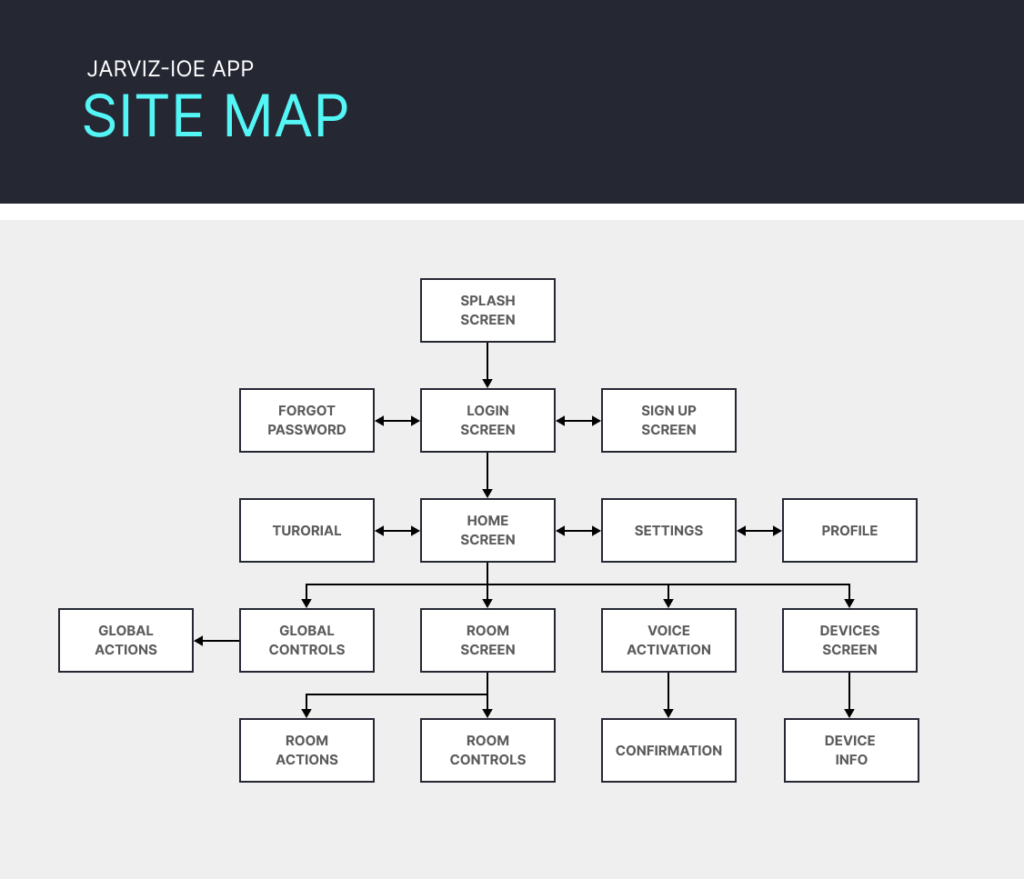
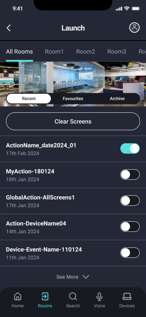
Ideation & Site Mapping
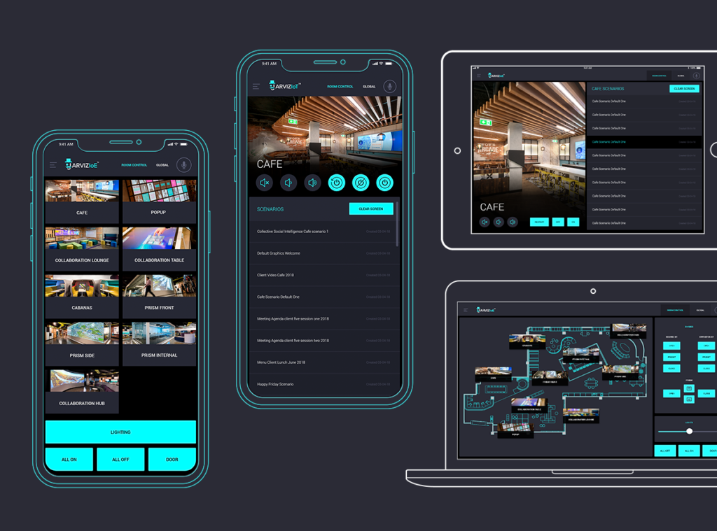
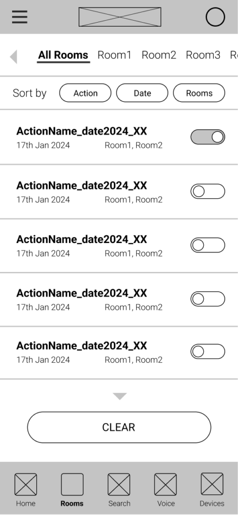
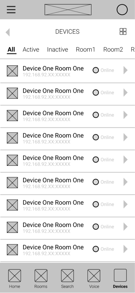
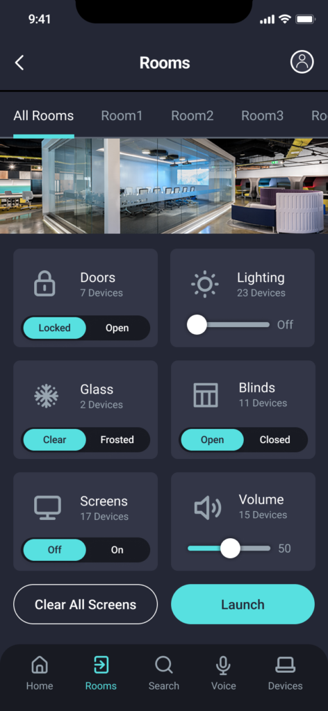
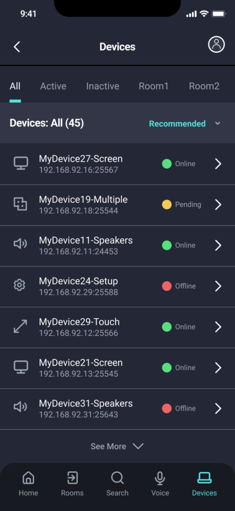
The previous app had evolved organically, with features added on an as-needed basis. I created a new site map to support clearer, more scalable navigation:
- Global Controls (building-wide actions)
- Room Controls (lights, AV, blinds, etc.)
- Content Launcher (files, programs, inputs)
- Favourites & Presets (personalized shortcuts)
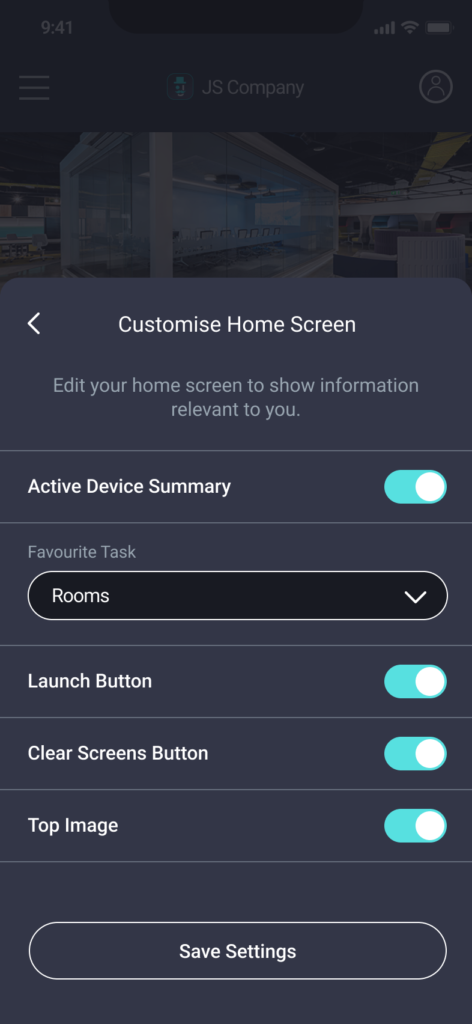
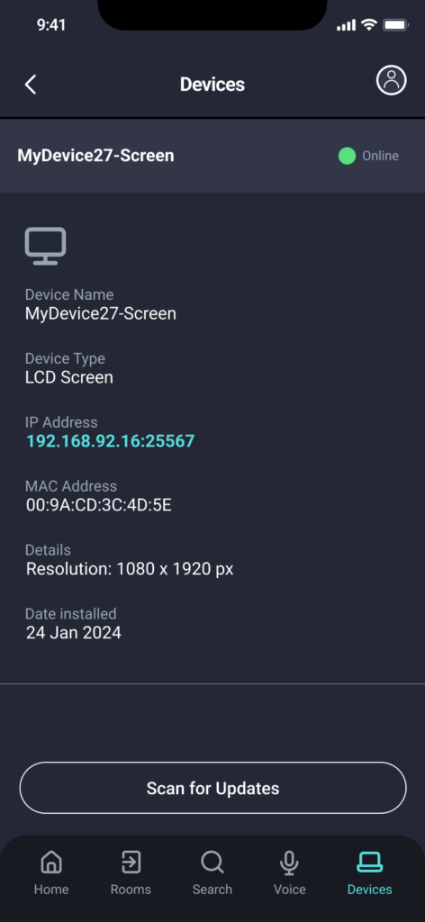
- Settings (redesigned for clarity and trust)
I also proposed role-based views—so facility managers and casual users would see different toolsets based on their permissions. This improved clarity while reducing cognitive overload.
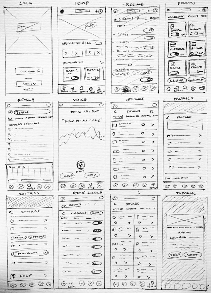
Wireframing: From Sketch to High Fidelity
I began with low- and medium-fidelity wireframes to explore key flows like:
- Launching content
- Controlling lighting/blinds
- Switching between rooms and floors
- Using voice commands with feedback
- Personalising the favourites menu
These wireframes were shared with stakeholders, tested internally, and adjusted based on feedback.
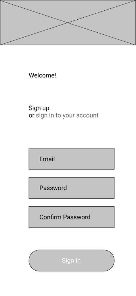
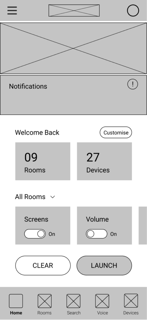
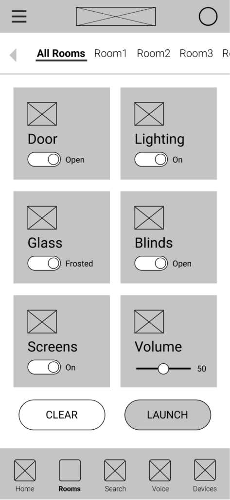
High-Fidelity Design
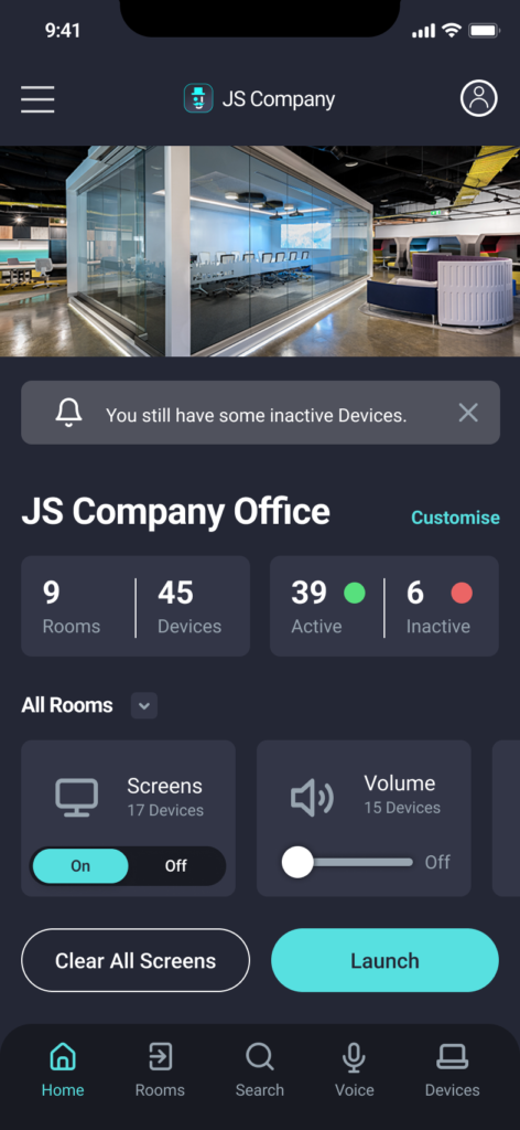
Once the structure was validated, I moved into high-fidelity mockups. Visual design was driven by a goal of clarity and calm—using clean spacing, bold iconography, and minimal colour to reduce visual noise.
New design elements included:
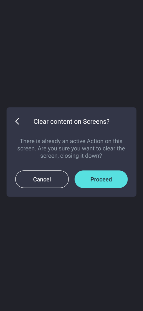
- Feedback animations (e.g. “Light Set to 50%”)
- Room headers that always showed the user’s current location
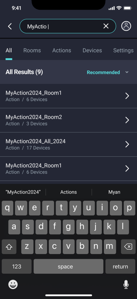
- Search and filter UI for large content libraries
- Voice command overlays showing recognition status
- Soft shadows and rounded corners for a modern, friendly aesthetic
I also updated the branding system with a modular colour palette and refined typography that scaled across apps, print materials, and videos.
Prototyping & Testing
Using Adobe XD and Figma, I built fully interactive prototypes. Key testing objectives:
- Can users tell whether they’re controlling a room or the whole floor?
- Can users locate and launch content in under 10 seconds?
- Can users understand voice command feedback?
- Do users feel more confident in pressing controls?
User testing showed dramatic improvements:
- Control clarity increased significantly
- Search times dropped by over 50%
- Voice command trust increased once visual feedback was added
- Menu misclicks were reduced through clearer labels and spacing
To check out the final prototype, click HERE.
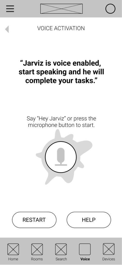
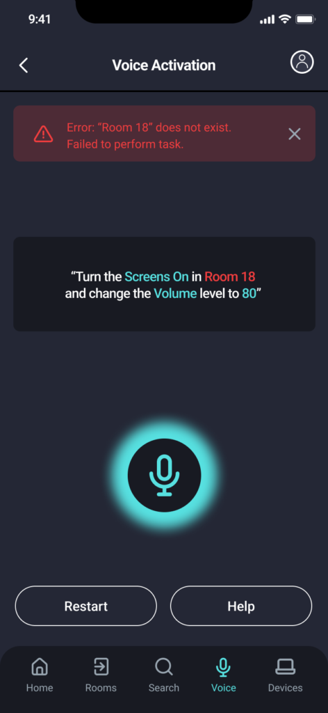
Voice Activation Rework
The original voice system had no feedback, causing confusion. Users assumed it wasn’t working.
I redesigned the voice interaction flow:
- A listening indicator activates on command
- A transcription window displays what was heard
- Visual confirmations show what was actioned (“Blinds closed.”)
- Error messages guide retry attempts
This reduced frustration and made voice control a more viable option in fast-paced meetings or hands-free environments.
Launch & Rollout
Once the prototype was finalised, I led the integration and rollout phase:
- Worked closely with engineers to implement the design
- Conducted QA testing and filed usability bugs
- Delivered custom site configurations for each client
I travelled to New York, Sydney, and Bendigo to install software and provide in-person training. I also produced:
- Training videos for staff onboarding
- Interactive product guides and slides
- Marketing websites and landing pages
- Printed user manuals and quick-start sheets
Post-Launch Support & Iteration
Following launch, I joined the remote support team to:
- Respond to real-time feedback
- Prioritise bugs and enhancement requests
- Propose new features based on analytics and support data
I continued working on experimental features, including:
- New display formats for wall-mounted screens
- Improved touch support for kiosk-style installations
- Proprietary app launching logic based on roles or schedules
Outcomes & Business Impact
The redesign had a measurable impact:
- User error rates decreased significantly
- Content was launched faster and more confidently
- Positive user feedback increased across all client sites
- Clients adopted new features like voice control and favorites
- The updated branding improved the product’s perception in competitive tenders and marketing efforts
The result was a product that aligned with Get-CSI’s vision while genuinely supporting user needs.
Reflection & Learnings
This project marked a shift in my career from graphic design to user-centred product design. The early version of the app was polished visually, but usability was not part of the original process. Revisiting the product years later allowed me to reframe the solution through a UX lens.
Key lessons:
- Research is non-negotiable. What users say, do, and struggle with provides the foundation for meaningful design.
- Small interactions matter. Simple confirmations and thoughtful labels can reduce errors dramatically.
- Consistency breeds confidence. Visual and functional consistency allows users to learn the system quickly.
- Design is never finished. Feedback loops, testing, and continuous iteration are essential for long-term success.
Most of all, I learned how to advocate for users inside a technical organisation—translating real-world challenges into elegant, usable solutions.