Project Overview
Wellness With Ying (wellnesswithying.com) is a Melbourne-based naturopath start-up focused on helping people on their health journeys, guided by the ethos “Nourished by nature. Backed by science.”
When Ying approached me, she was launching from scratch—a dream project for any designer but also a unique challenge. The brief was to develop a complete brand identity, logo, website design, and marketing materials that felt natural, approachable, and trustworthy, while avoiding common pitfalls of the wellness industry such as generic “greenwashing” or confusion with homewares and plant shops.
Objectives & Strategy
From the outset, we aimed to create a brand that communicated holistic, nature-based care in a professional, evidence-informed way. Importantly, Ying wanted the brand to feel inviting without skewing too feminine or floral—so it would appeal to a broad audience, including men who might otherwise feel excluded by typical wellness visuals.
An additional design constraint was to incorporate the initials “WWY” subtly within the logo, adding personal meaning without sacrificing simplicity.
Design & Development Process
I started with competitive analysis and moodboarding, looking at how wellness, skincare, and health brands positioned themselves. Many felt overly polished or leaned heavily into stereotypical pastel florals. We discussed ways to differentiate through colour, typography, and symbolism.
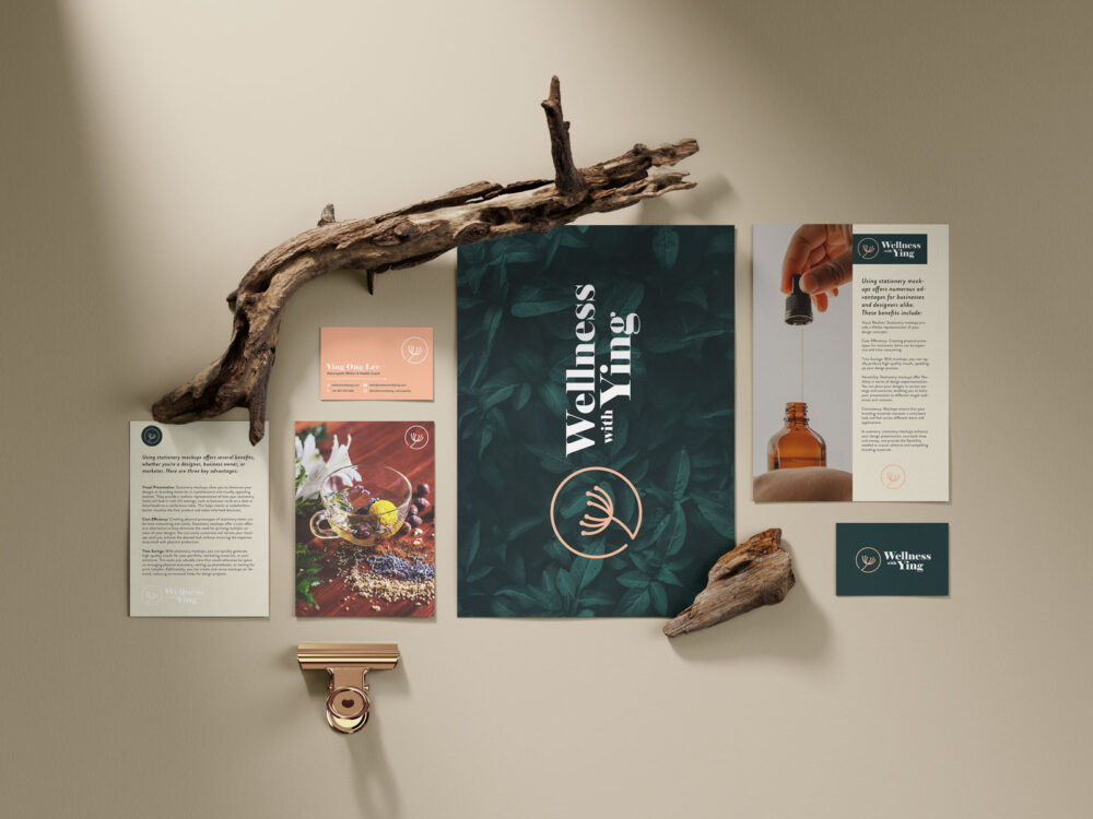
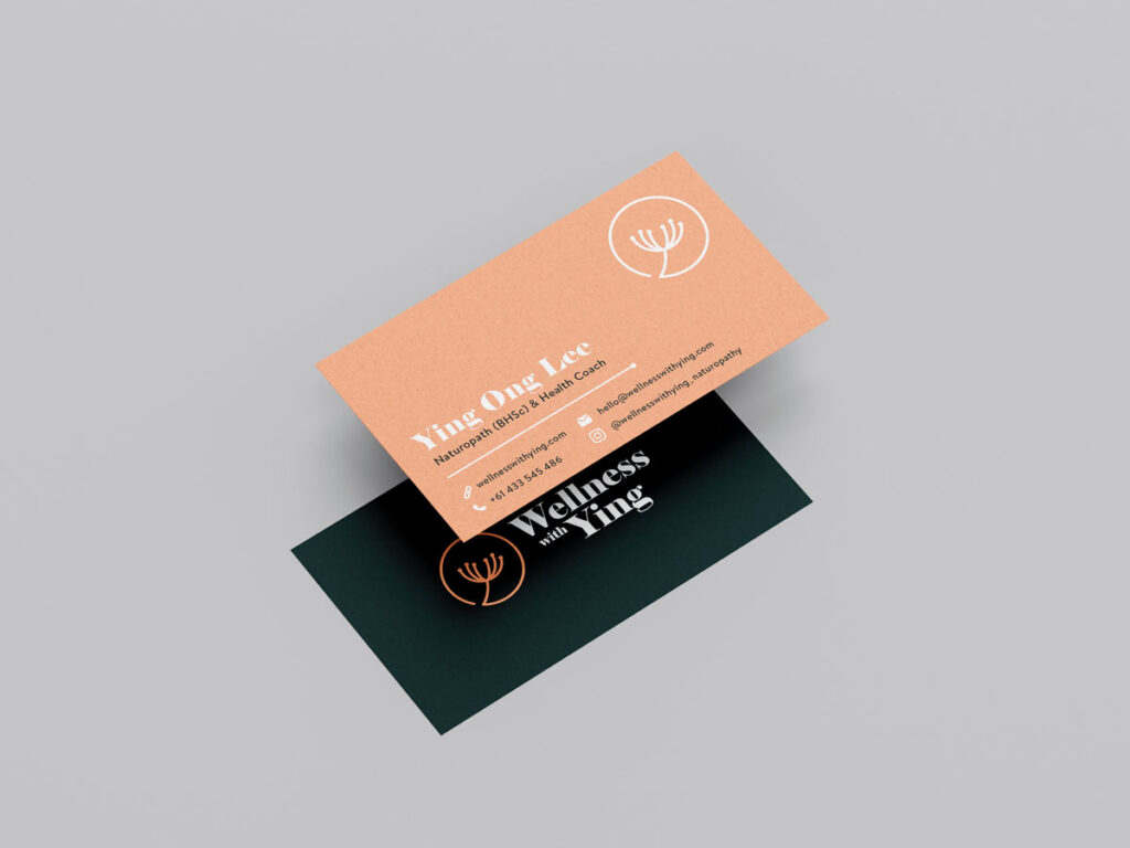
For colours, we landed on a deep forest green to represent growth, health, and nature, paired with a pale salmon for a human, face-to-face element that softened the palette without feeling overly feminine.
Ying loved dandelions and used them in her practice, so I explored ways to incorporate that organic motif into the logo while hinting at the “WWY” initials. Through several sketches and digital iterations, we achieved a mark that felt unique, personal, and versatile across mediums.
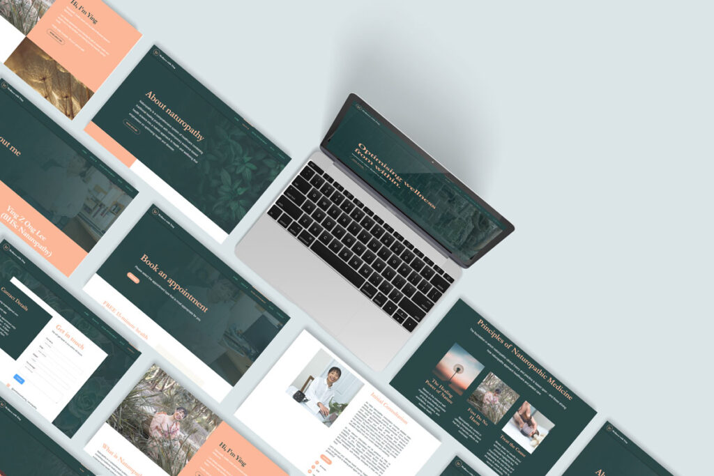
Once the core brand system was approved, we expanded it into a website design that was clean, modern, and informative. We also created business cards, brochures, posters for her clinic, and social media templates. Because the colour palette and visual language were well-defined early on, these applications rolled out smoothly and consistently.
Impact & Outcomes
The final brand identity has given Wellness With Ying a distinctive, professional presence in a crowded market. Ying was especially pleased with the subtle, meaningful logo and the welcoming but grounded tone of the website and materials.
Feedback from her clients has highlighted the brand’s warm yet scientific feel, aligning perfectly with her promise of natural care informed by evidence. For Ying, the cohesive identity has made marketing simpler and helped her communicate her unique approach confidently.


Reflection
This project reinforced the power of listening carefully and designing for nuance. By avoiding clichés and truly considering her audience and philosophy, we created a brand that stands out authentically—and will grow with her practice.